News
Designing monograms is a fun occupation
Graphic design
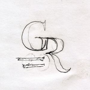
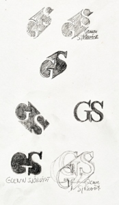
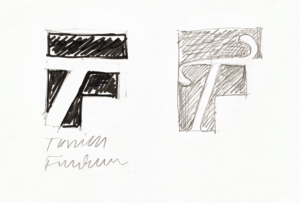
The design of monograms using initials is great fun. The drawing and construction of contrast in black and white, the thin and thick strokes, and the addition of a name can give much pleasure. Here are some monograms I recently designed for private use. We are using our own typefaces: IDT Swedoni and Nordling BQ.
Merry Christmas and Happy New Year!
Marketing news

A Resumé Article on Our Work with the Swedish Armed Forces
Graphic design
In November 2025, the Swedish online magazine Resumé, which covers communication, advertising, and design, interviewed me and Ylva Lipkin. We were responsible for Pangea Design’s work on a new visual identity for the Swedish Armed Forces in 2005. In the interview, we talk about the long-running process that was halted just before launch, almost exactly 20 years ago. It was my dream assignment—but not all dreams come true.
Bakom kulisserna av Försvarsmakt ns logotypkris 2005 – Resumé
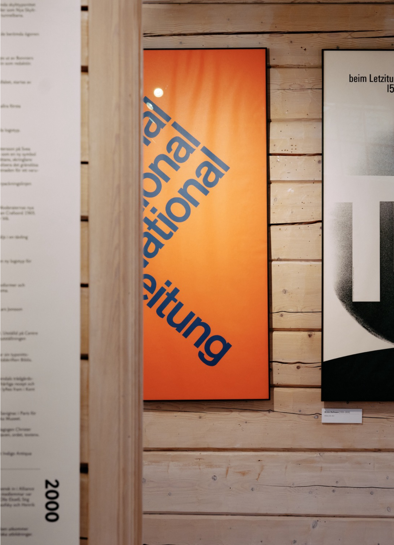
Bokstavligt/Lettered Exhibition on display in Stockholm
Exhibition
The Bokstavligt/Lettered Exhibition will be on display September 13–30 at Hornstull Library, Hornsbruksgatan 25, Stockholm.
https://biblioteket.stockholm.se/evenemang/vernissage-bokstavligt-med-orjan-nordling-1
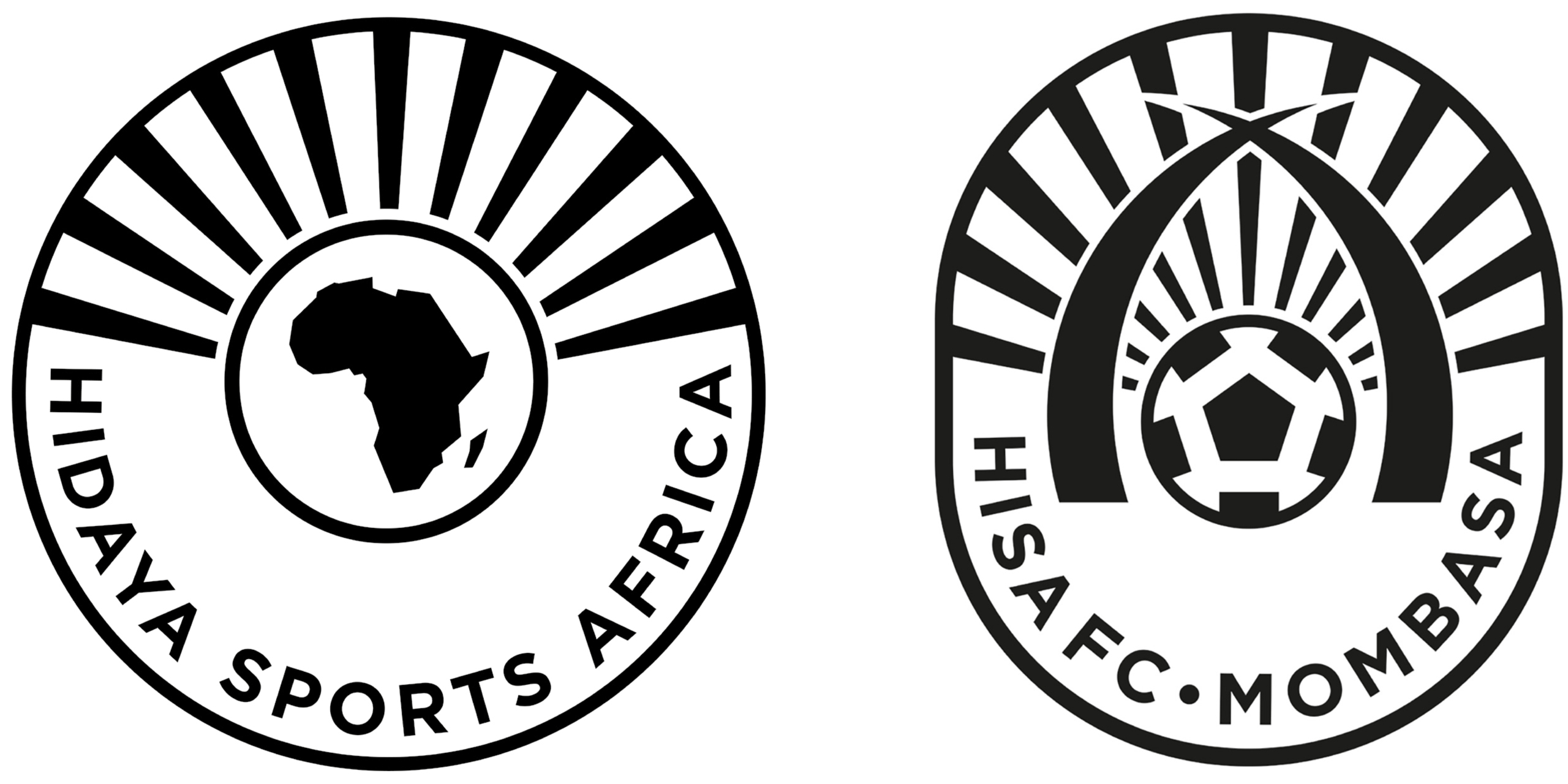
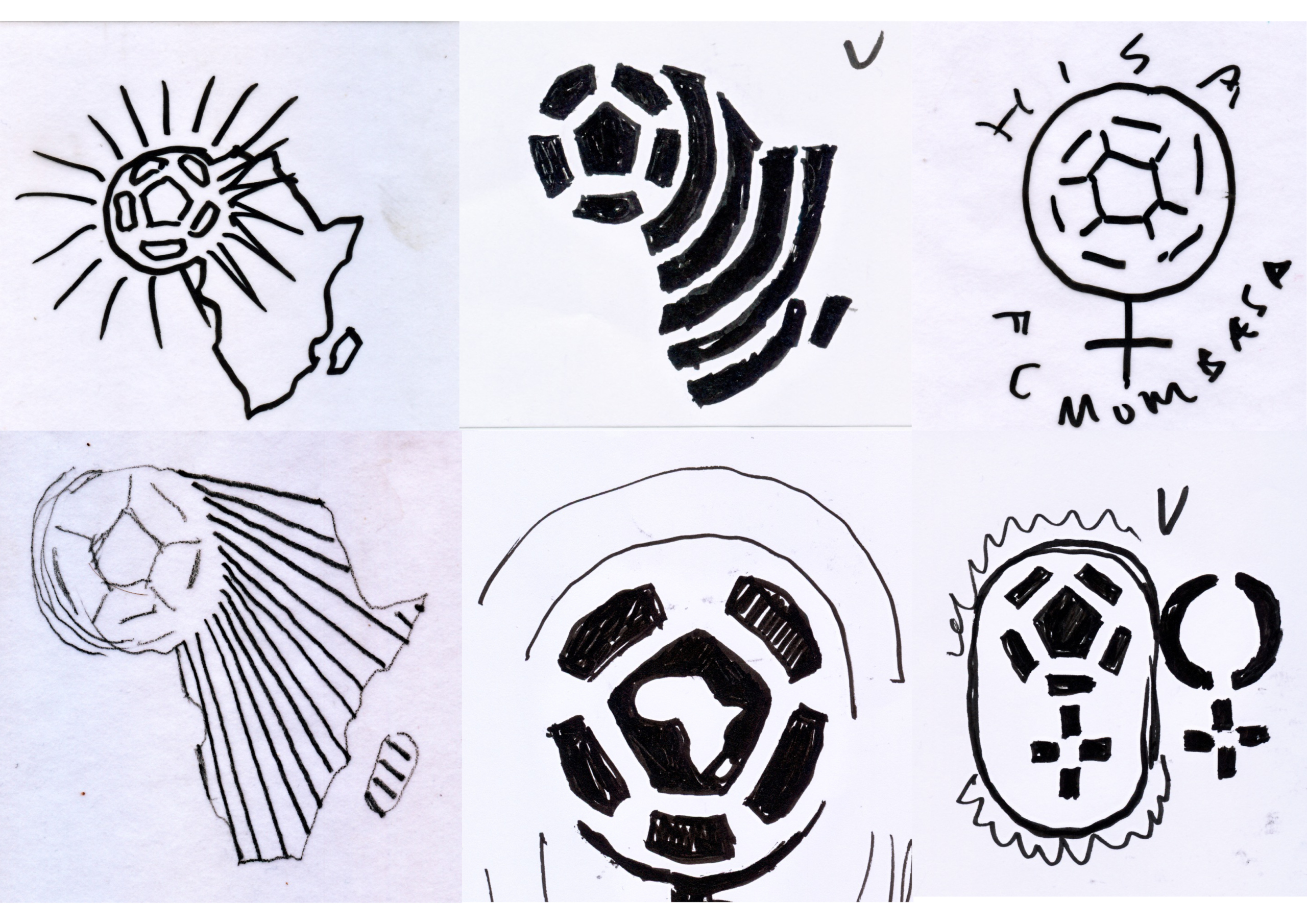
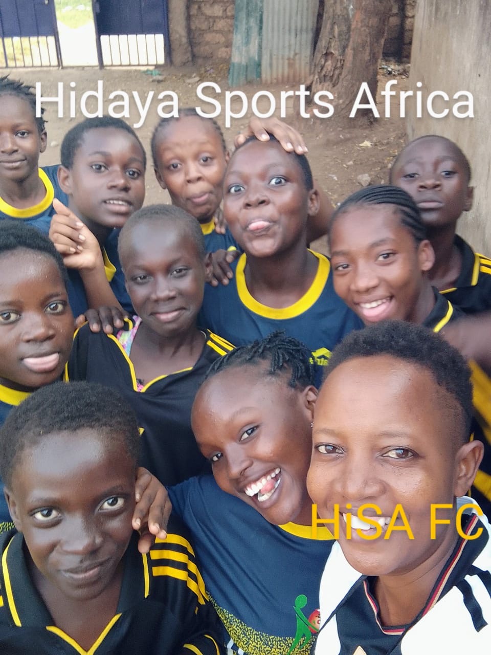
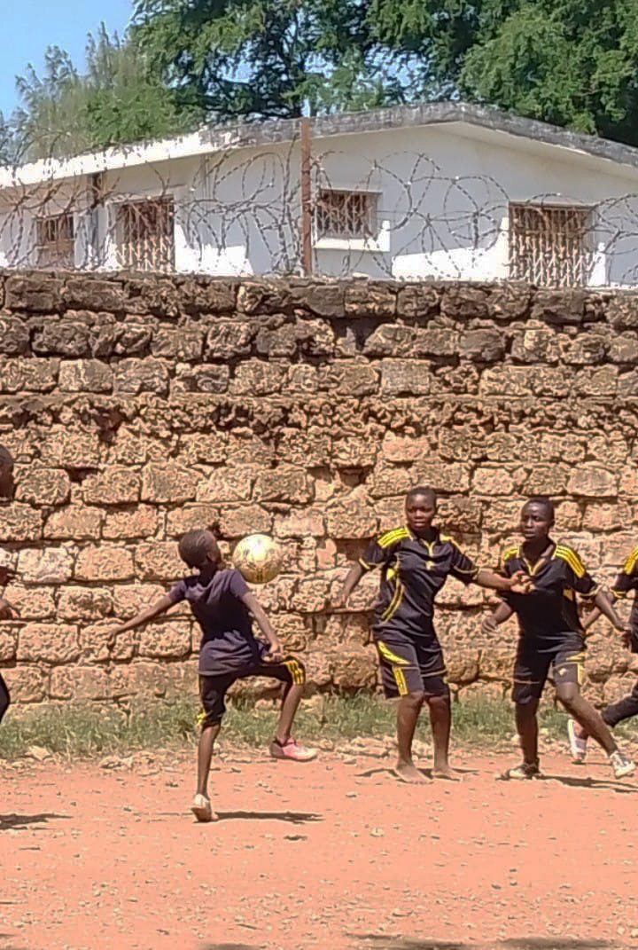
Logotypes for a Girls’ Football Club in Mombasa
Graphic design
A former colleague of mine, Britta Risholm, asked if I would help with a voluntary design project for an organization in Africa. Given my own roots in today’s Democratic Republic of Congo—where I was born in the late 1950s as the child of missionaries—it felt only natural to say yes.
In Mombasa, Kenya, opportunities for girls are few and far between. The academies that exist are often profit-driven, focused more on returns than on the actual needs of children and young people. It’s not a lack of interest in sports that holds girls back, but rather a society that rarely prioritizes their opportunities. Out of that frustration, Hidaya Sports Africa was founded in 2025 by Folke Risholm, Idil Roble Ari, and Lydia Zawadi.
The mission is clear and vital: to give girls the chance to play football. The initiative consists of both the association Hidaya Sports Africa and its football club, HISA FC (Hidaya Sports Africa Football Club). The name Hidaya means “guidance,” a value that runs through everything they do. Another guiding phrase is “where it starts”—a reminder that the organization is a place for girls to begin their journey, though not necessarily where it has to end. Looking ahead, the vision reaches beyond sports, toward mentorship, scholarships, and other support that can help girls take the next step in life.
My role was to create two logos: one for the association itself, and one for the football club. The association’s emblem needed to reflect a strong connection to the African continent, while the club’s badge should unite three key elements—Mombasa, girls, and football.
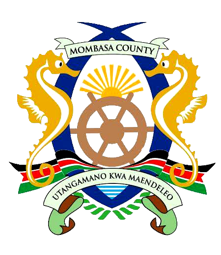
Early ideas centered on combining a football with the outline of Africa and the female symbol. I also drew inspiration from Mombasa’s heraldic crest, with its distinctive elephant tusks and a radiant sunburst symbolizing enlightenment, hope, and determination. Using these elements, I designed two logos—different in identity yet connected in spirit. The broader vision is that other cities across the African continent can one day join in, carrying the same graphic language forward.
A tribute to Paul Rand
Marketing news
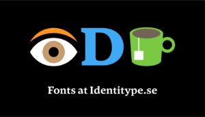
As a newly established type foundry, we need to find humorous ways to market our business. We’ve taken inspiration from Paul Rand’s iconic poster solution for IBM, where he plays with the Eye, the Bee, and an M. We propose the Eye, a D, and a cup of tea for “IDT,” our company prefix. IDT stands for Identitype, which in turn stands for high-quality typefaces.
Read more on the IBM logo design story here:
Pictograms for National Property Board (Statens fastighetsverk)
Graphic design
![]()
In collaboration with the experienced signage and wayfinding company HolmquistSign, Identitype has developed a set of pictograms for the government agency National Property Board of Sweden (Statens fastighetsverk). The pictograms follow the agency’s recently revised visual identity in both form and expression. They also comply with SIS standards for international symbol language.
The pictograms have been designed in a functionalist style and match the agency’s house typeface, SFV Funkis, combining beautiful proportions, elegance, and expressiveness with a modernism rooted in the functionalist movement that gained prominence in Sweden during the 1930s. The pictograms are available in positive, negative, and outlined versions.
The new pictograms will be used at all locations and visitor destinations managed and owned by the SFV, both indoors and outdoors. They are intended to help visitors navigate accurately, find their way, and access relevant information and guidance.
We at Identitype are proud to have been part of this important assignment.
Client: Stefan Trolle Lindros, SFV, Dan Holmquist, HolmquistSign
Designer: Örjan Nordling and Anders Wikström, Identitype
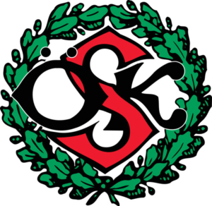
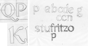
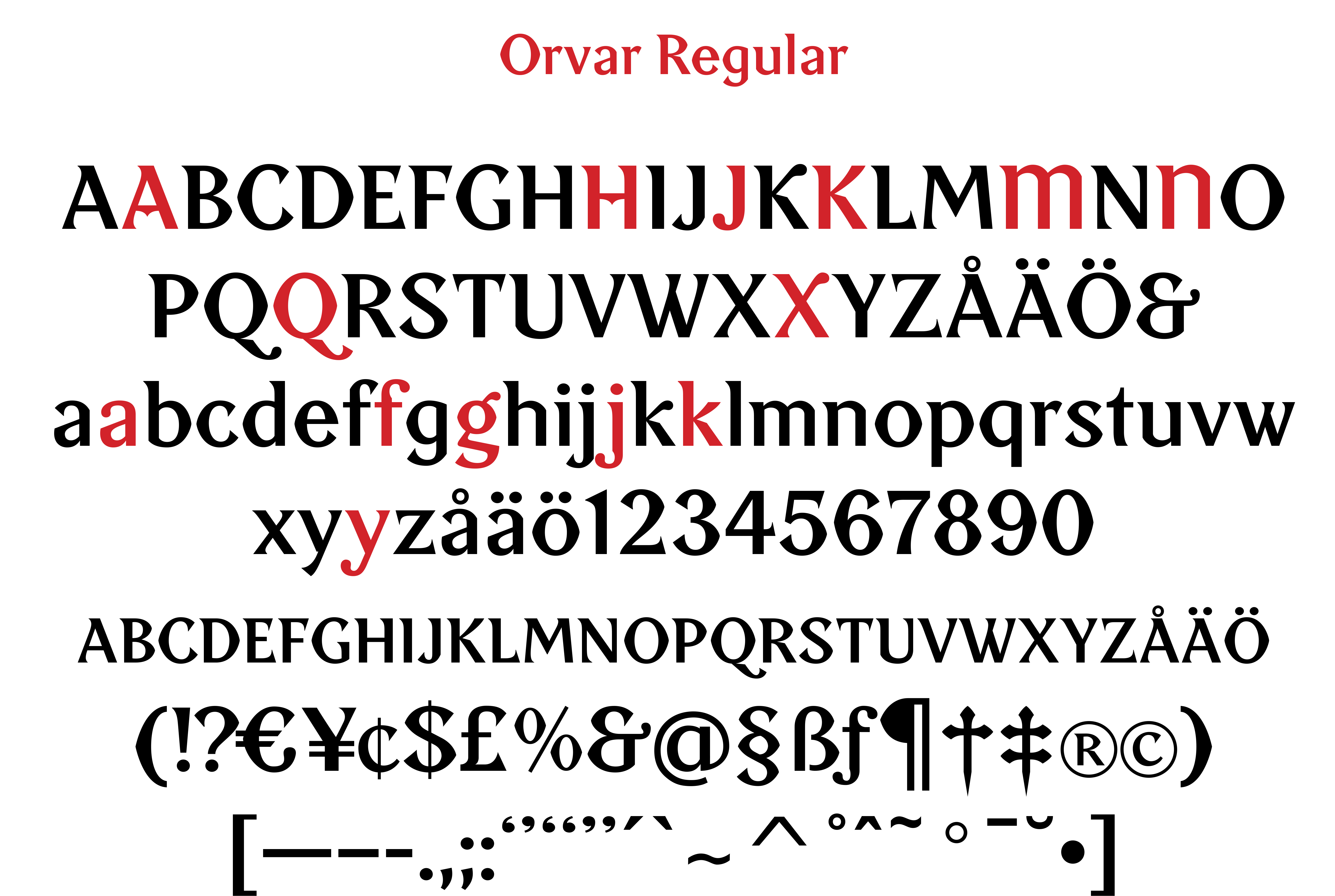
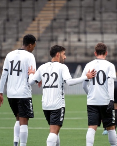
Orvar, a typeface for Örebro SK
Custom font
Wow, I’m so happy! My football team, Örebro SK, will play the men’s preseason matches wearing jerseys with my typeface “Orvar” on the back. The typeface is named after Orvar Bergmark [1930–2004], the club’s most famous player of all time.
“Orvar” draws its foundation and inspiration from ÖSK’s club emblem from 1908. The capital letters ÖSK in the emblem are designed in a characteristically Art Nouveau-inspired style, featuring “bifurcated” letters – split into two horizontal parts – which give them a unique character.
A good, identity-creating display typeface should not only be easy to read but also carry a sense of emotion and tradition. “Orvar” tells the story of a sports club that has always stood for pride, heart, and passion and has mostly belonged in football’s top tier. And that’s where we want to return!
I designed the typeface back during the successful Allsvenskan seasons of 2009–2010, together with designer Göran Söderström. But it is only now that it gets to see the light of day in thrilling match situations!
I truly hope that “Orvar” can contribute to ÖSK’s success in the crucial spring cup matches of 2025!
https://www.facebook.com/share/p/1DpCCnAhxM/
https://www.instagram.com/p/DFNX2zZIVIg/?utm_source=ig_web_copy_link&igsh=MzRlODBiNWFlZA==
Typofix representative
Merits
Identitype owner Örjan Nordling has been appointed swedish representative in the Typofix Project.
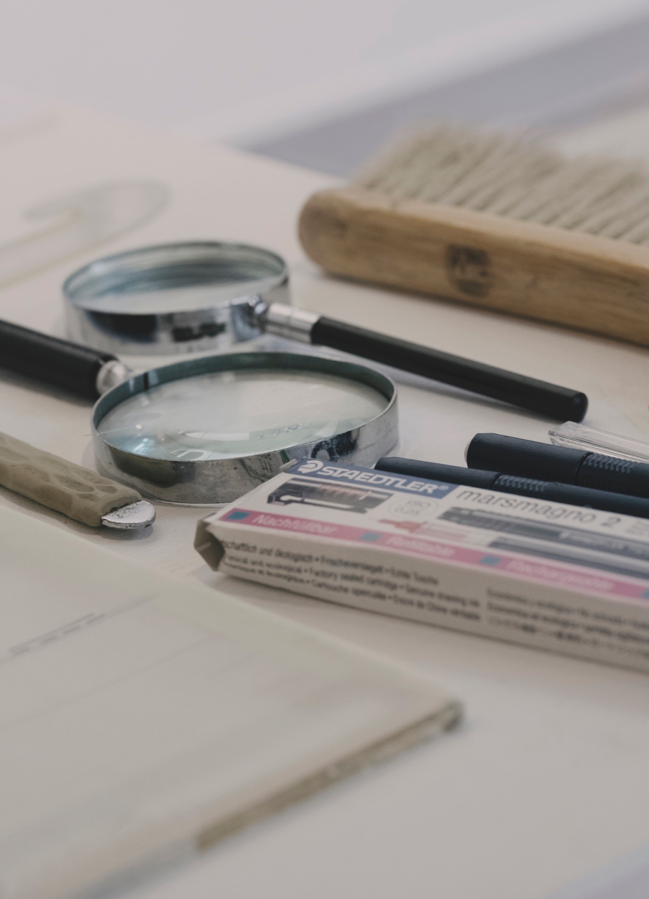
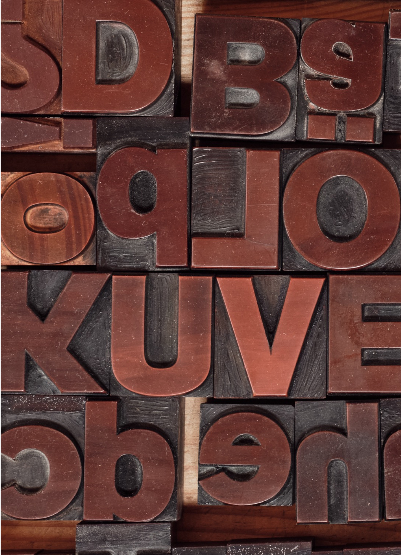
Bokstavligt/Lettered: A Narrative on Typography
Exhibition
Letters and typefaces are crucial tools in graphic design and visual communication. In our modern writing system, the Latin alphabet serves as the foundation. Typefaces represent the visual style in which letters are presented.
There are thousands of different typefaces to choose from, varying in style, size, expression, and other characteristics. Each typeface may have its own specific use, with some suitable for headlines and others more appropriate for body text. By selecting the right typeface, one can create a particular atmosphere, convey a specific message, and enhance readability. This is what we refer to as typography.
When I was asked to have an exhibition of my work, my first thought was – I’m not an artist but a graphic designer.
But if you think further, graphic design is a kind of “everyday art”.
We come into contact with it every day in the form of text and images in various channels and contexts. Messages are constructed with letters and symbols; they shape words that form sentences and give us meaning. Long after we are gone, the visual language persists.
This exhibition is about graphic design, but primarily about typefaces and typography. That’s what I’ve been involved in for almost 40 years.