Regular

About DN Wall
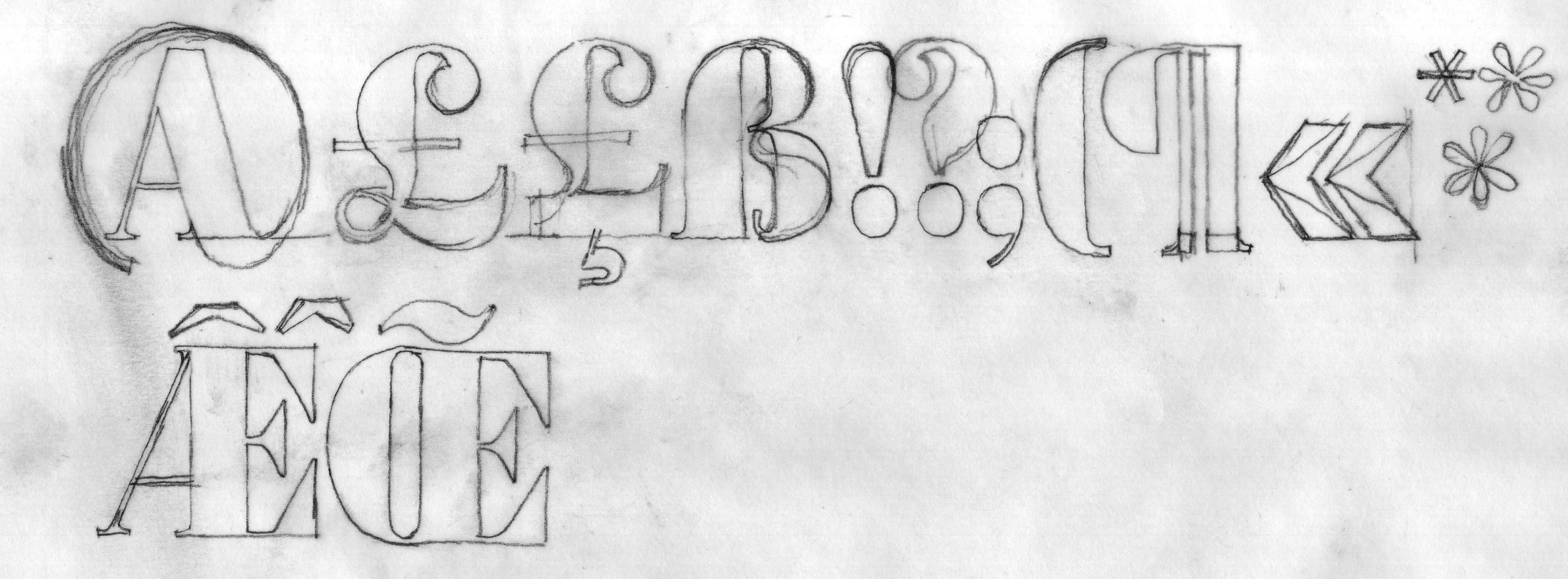
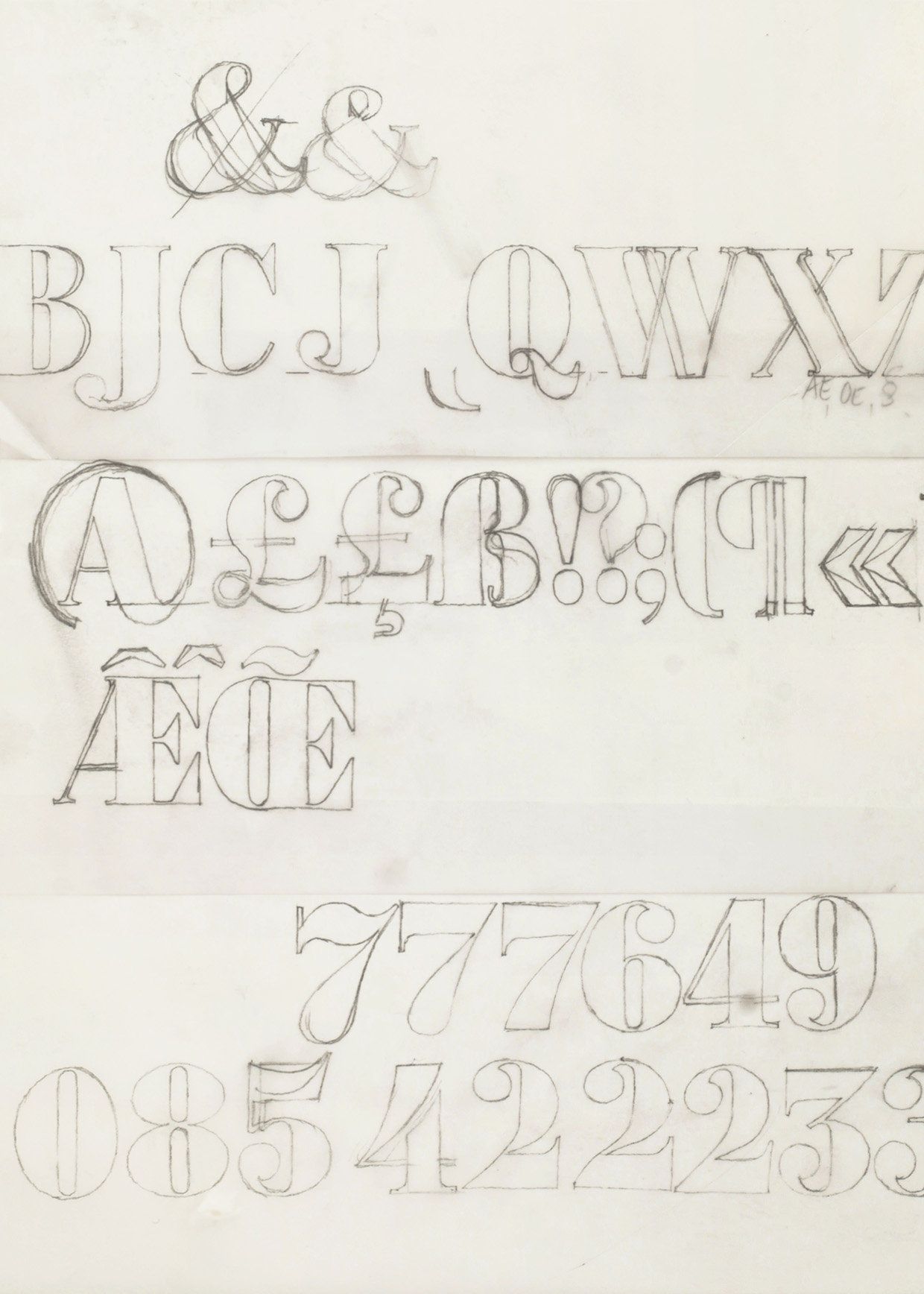
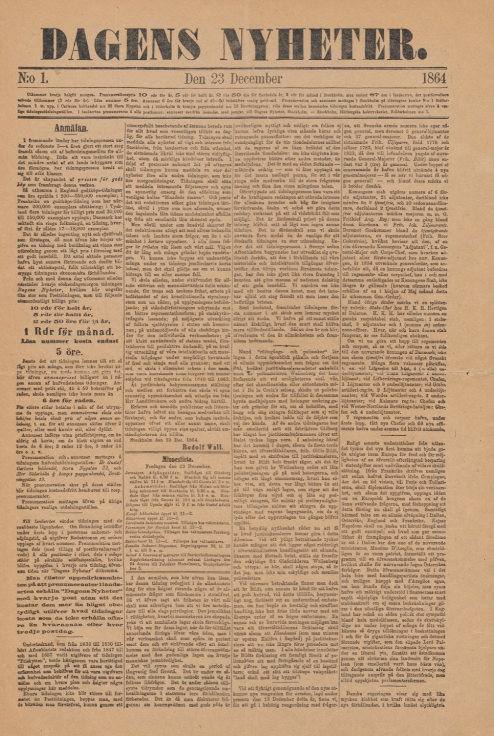
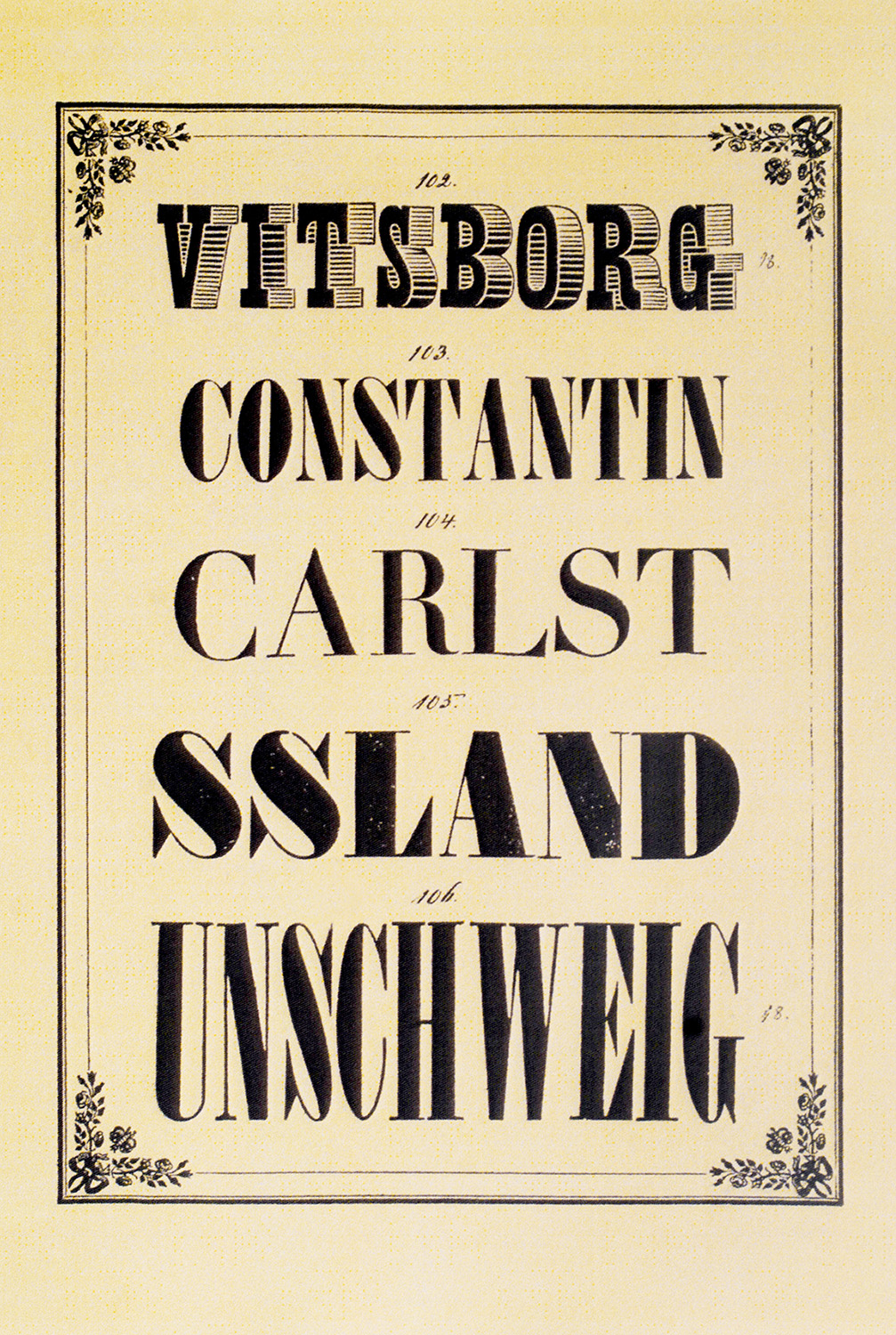
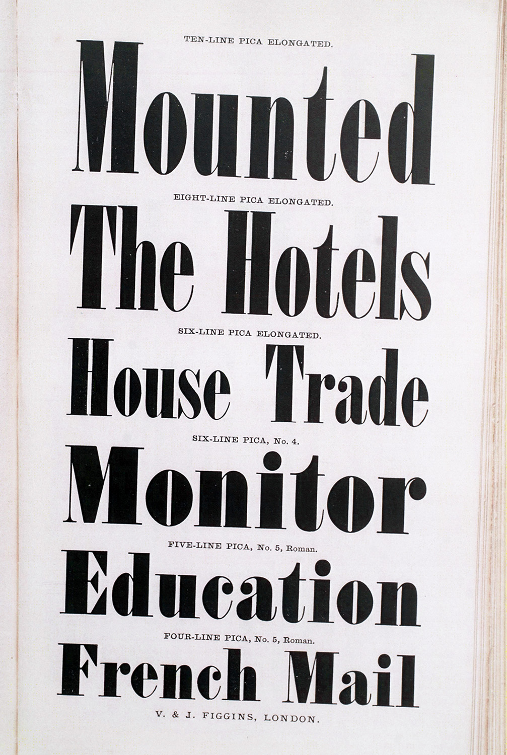
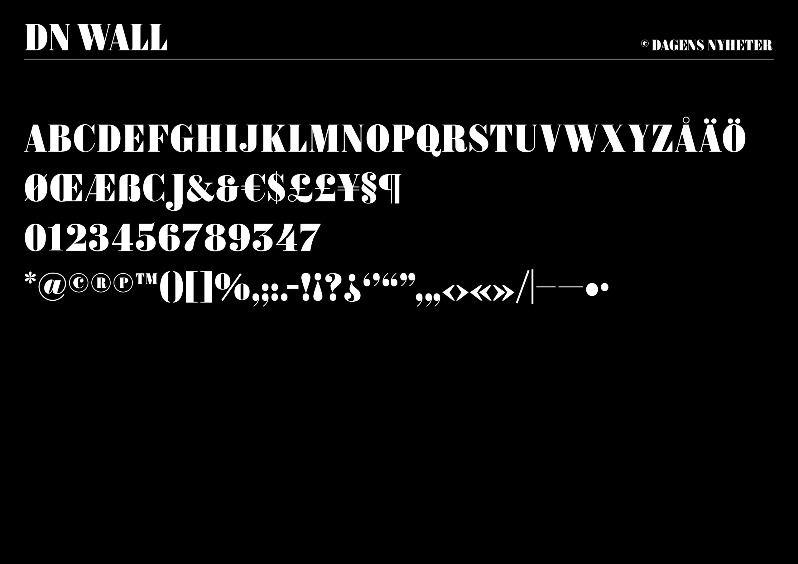
DN’s headline style is called ”Smal Fet Antikva” (Narrow Bold Antiqua). It was first shown in an English type specimen by Vincent Figgins in 1832. When Rudolf Wall founded DN in 1864, he chose this typeface for the newspaper’s masthead and added a period at the end of the logotype. It was probably a copy of Figgins’ typeface that was available at the Hörbergska Printing House in Stockholm.
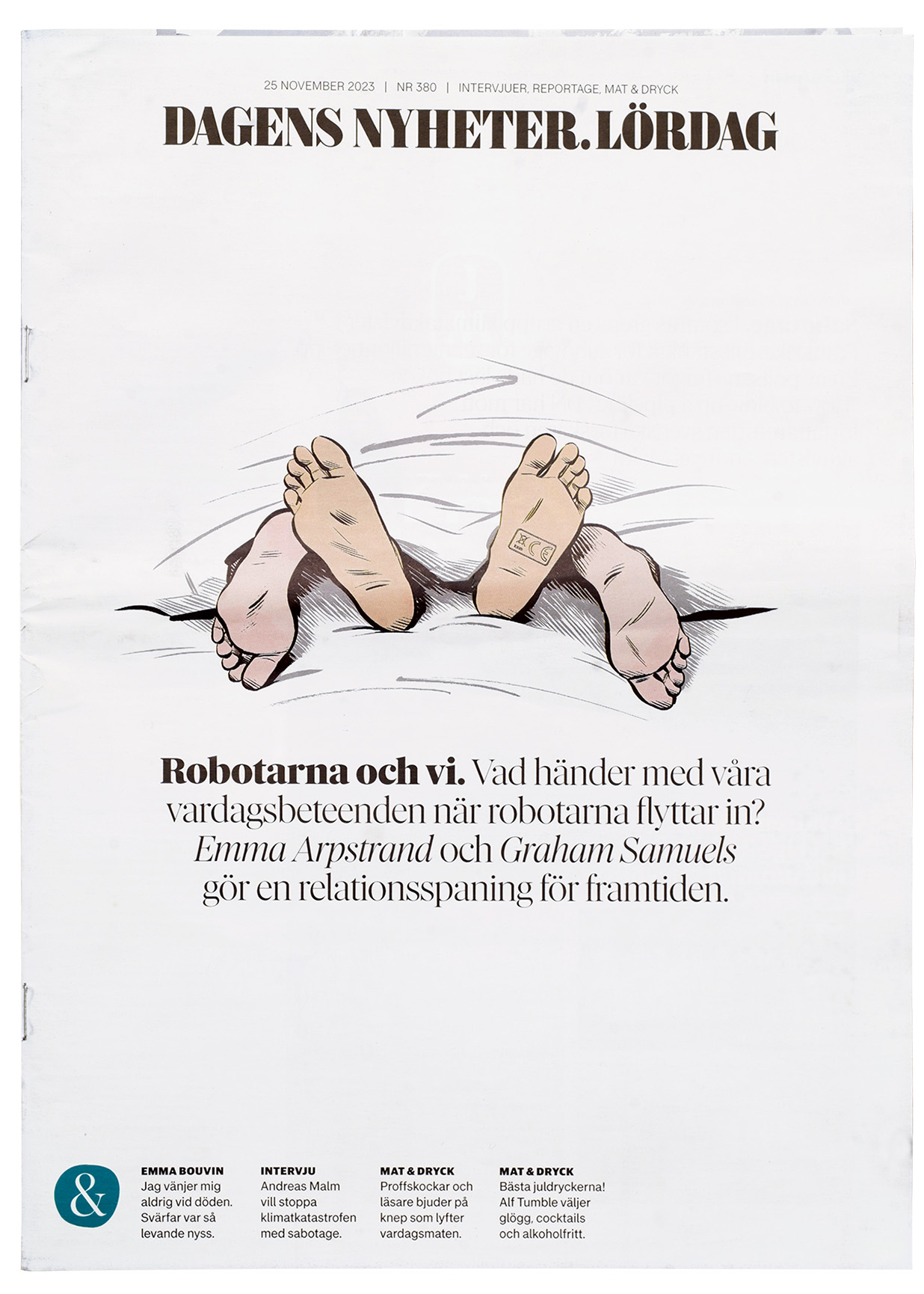
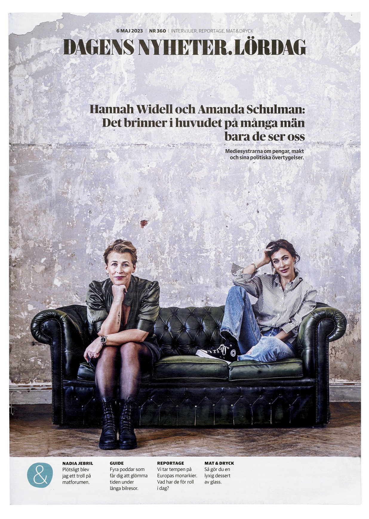
When DN transitioned to a tabloid format in 2004, the logotype was redrawn by the American designer Jonathan Hoefler. We were commissioned to create a complete masthead typeface based on his letterforms. This became DN Wall, and it is used as the headline typeface in the various editions.
- Designteam
-
Örjan Nordling, Fredrik Andersson, Mark Winelid.
- Client
-
John Bark, Rolf Stoor DN
- Header credit
-
Stockholm 1890’ies, Digitalt Museum
Regular

Regular