
Styles

About Zoegas Display
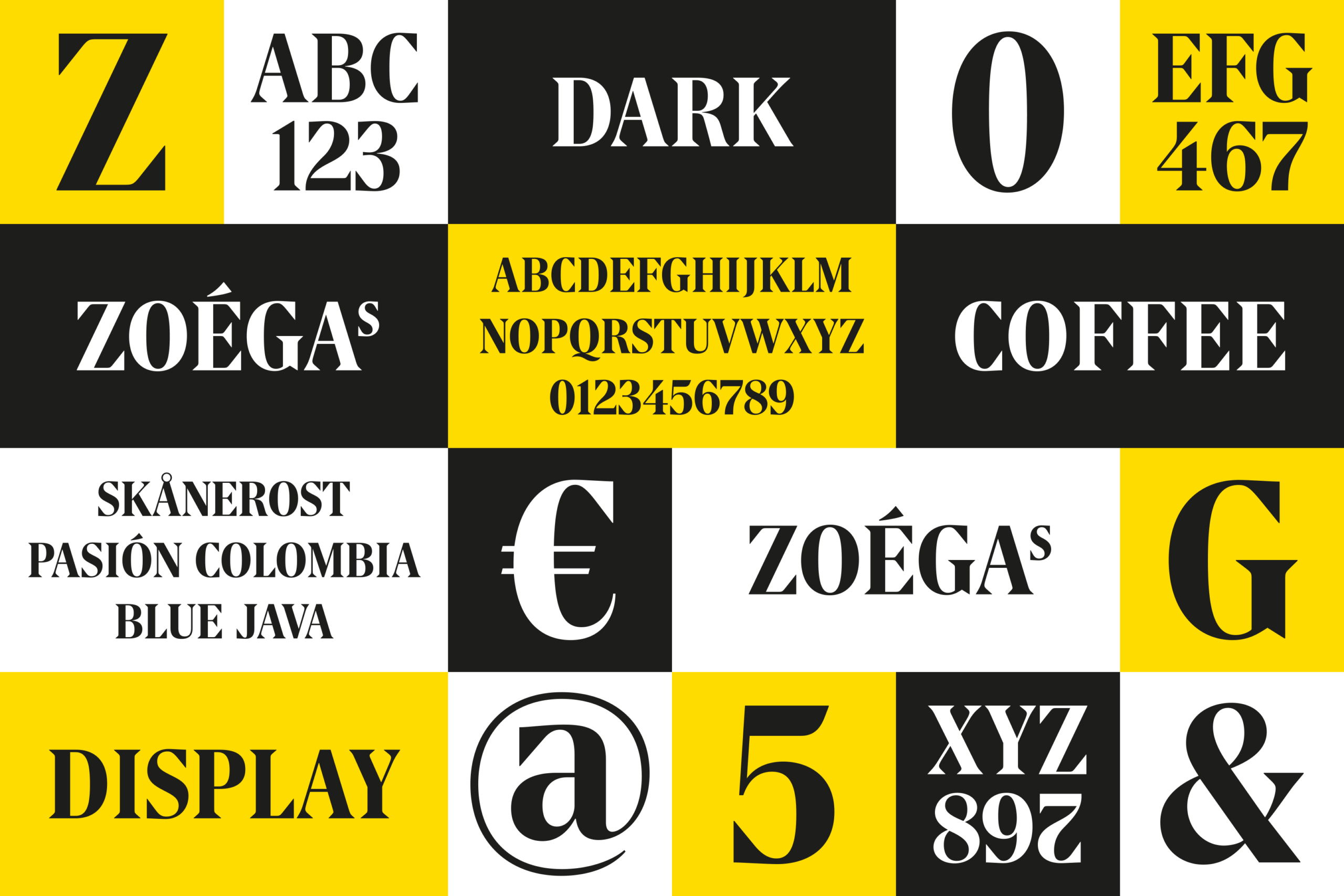
Our brief was that the new typeface should be based on the company’s logo. It was to be created exclusively in uppercase letters for use on packaging and marketing materials. Zoega Display resulted in high-contrast characters with clear, sharply cut, triangular serifs. There should simply be no doubt about which coffee supplier is the sender. Nor about the scent of the typeface.
- Design team
-
Örjan Nordling, Kristian Möller, Jennie Rudman
- Client
-
Nord DDB
Display

Collage with font in use.
Collage with font in use.
Display
