Styles


Styles


About ATG
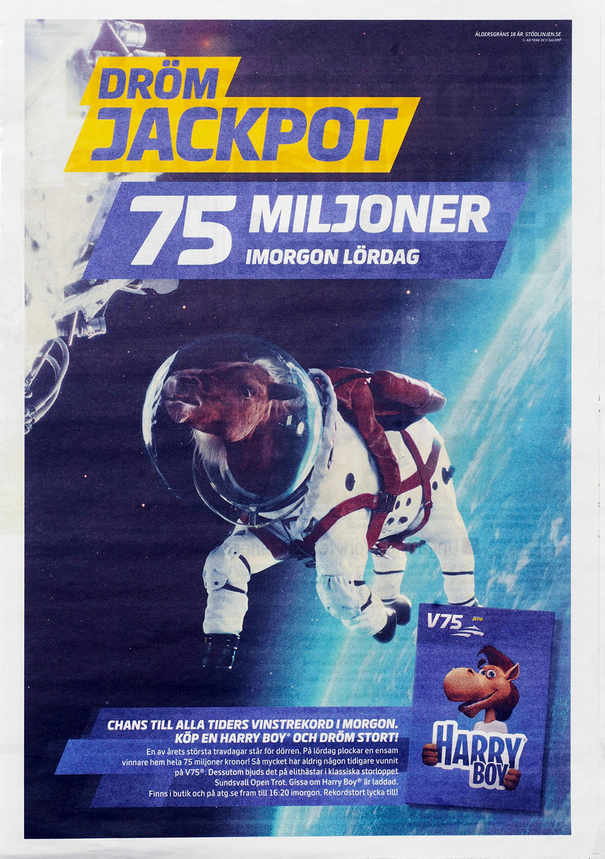
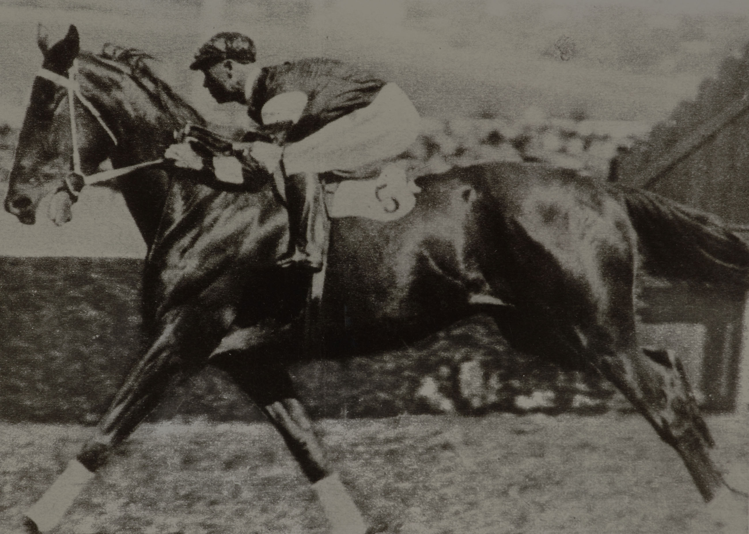
For ATG—the Swedish Horse Racing Totalisator Board—it was crucial to possess a distinct typeface that conveys the excitement of horse racing and betting.
ATG’s typeface finds application in receipts, betting slips, start lists, programs, advertising, marketing materials, apps, web, in-store, and ATG TV—a wide array of contexts.
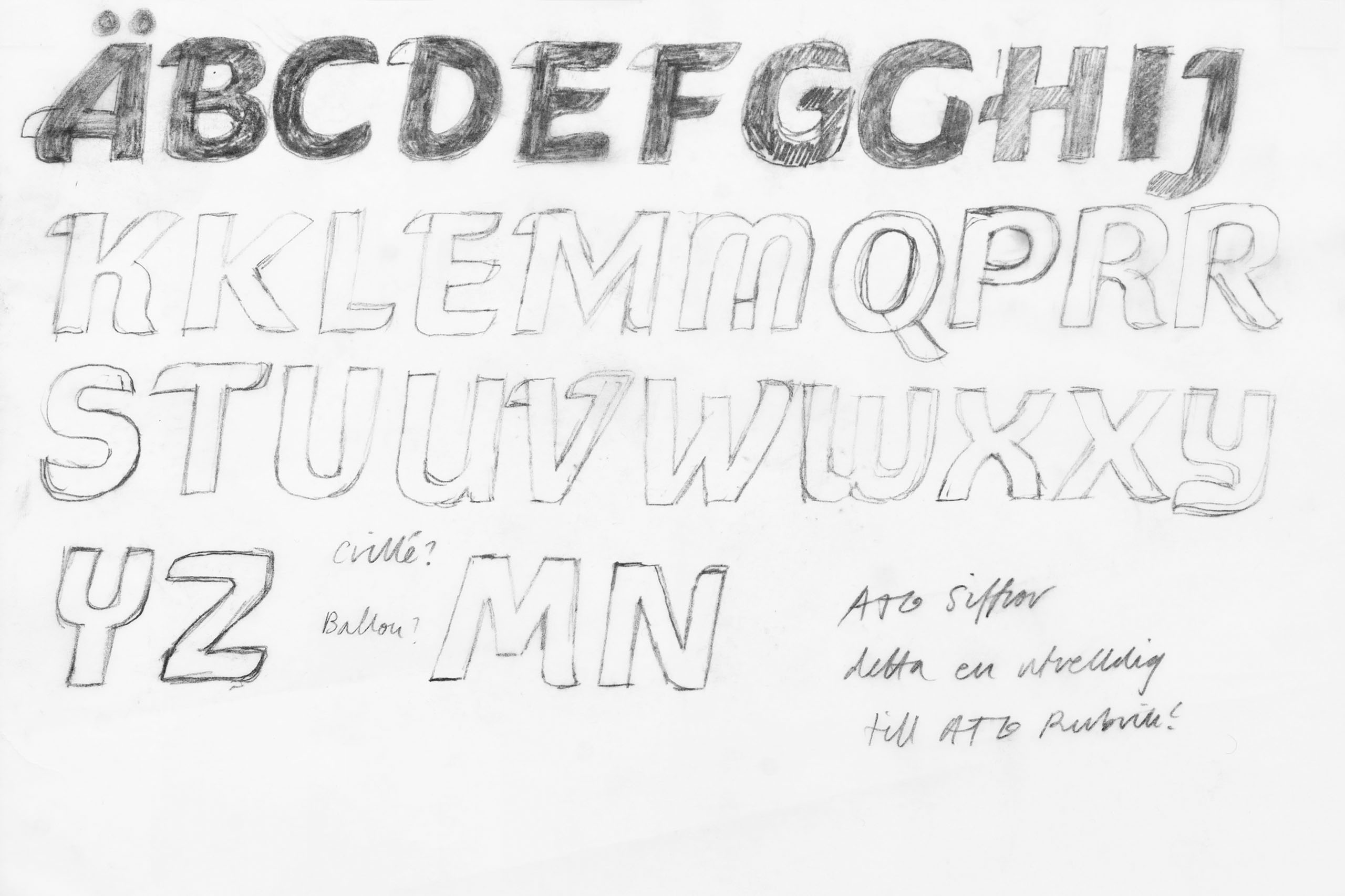
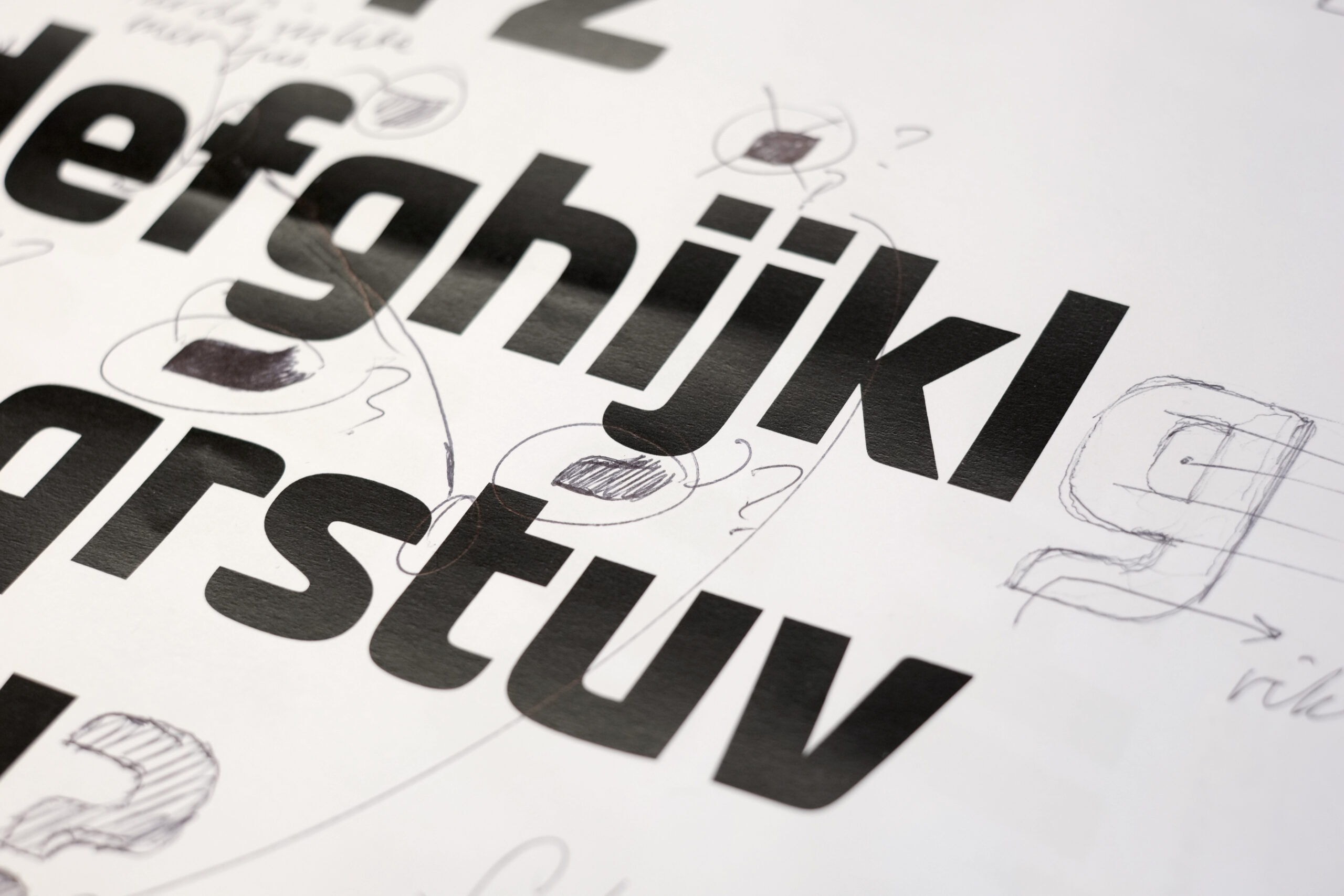
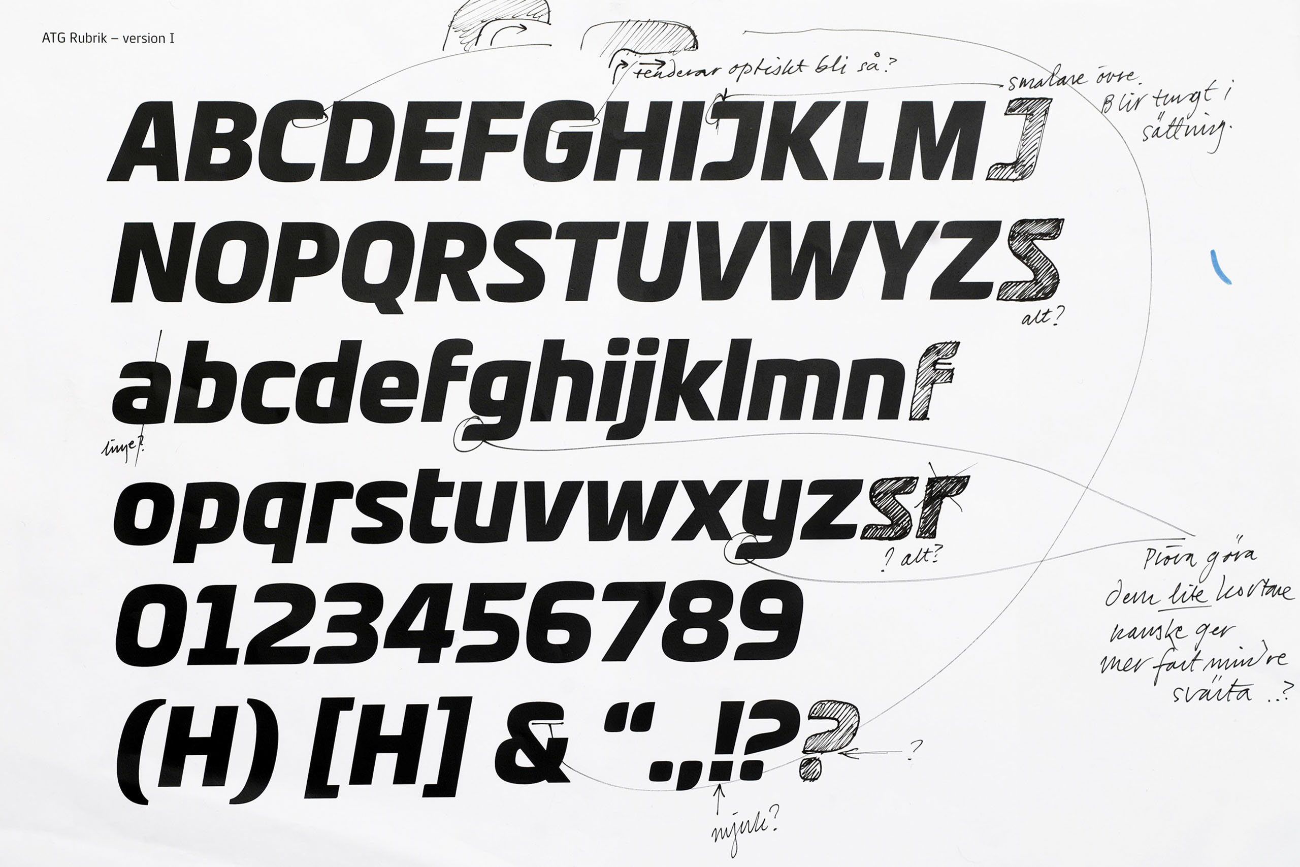
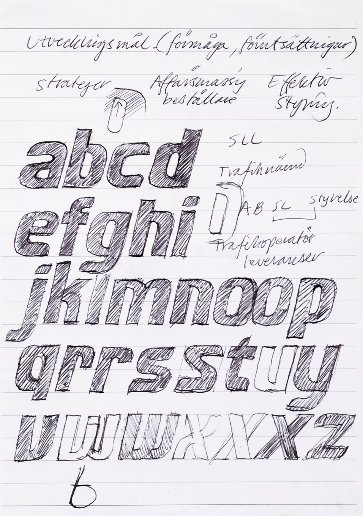
In addition to capturing the thrill of horse racing and betting, there was a need for a space-efficient typeface due to extensive print requirements. Drawing inspiration from their brand strategy, centered around a ”vivacious and engaging betting experience,” we developed letterforms and numerals for an extensive typeface family comprising ATG Rubrik (”Headline”), ATG Text, and ATG Text Mono—all optimized for digital usage.
ATG Rubrik and ATG Text Mono consist of two fonts each, while ATG Text encompasses eight fonts.
”We needed to encapsulate our entire brand identity in a packaging solution. Furthermore, we aimed to visually represent that trotting and thoroughbred racing are spirited equestrian sports intertwined with lively betting. Our new typeface played a pivotal role in achieving this.” Nils Ekmark, Brand Manager, ATG
- Design Team
-
Örjan Nordling, Göran Söderström, Kent Nyberg, Jan Abrahamsson, Kristian Rune
- Client
-
Nils Ekmark ATG, Bold
Rubrik

Rubrik Condensed

Text Light

Text Light Italic

Text Regular

Text Regular Italic

Text Medium

Text Medium Italic

Text Bold

Text Bold Italic

Text Extra Bold

Text Extra Bold Italic