Styles


About Vattenfall Hall
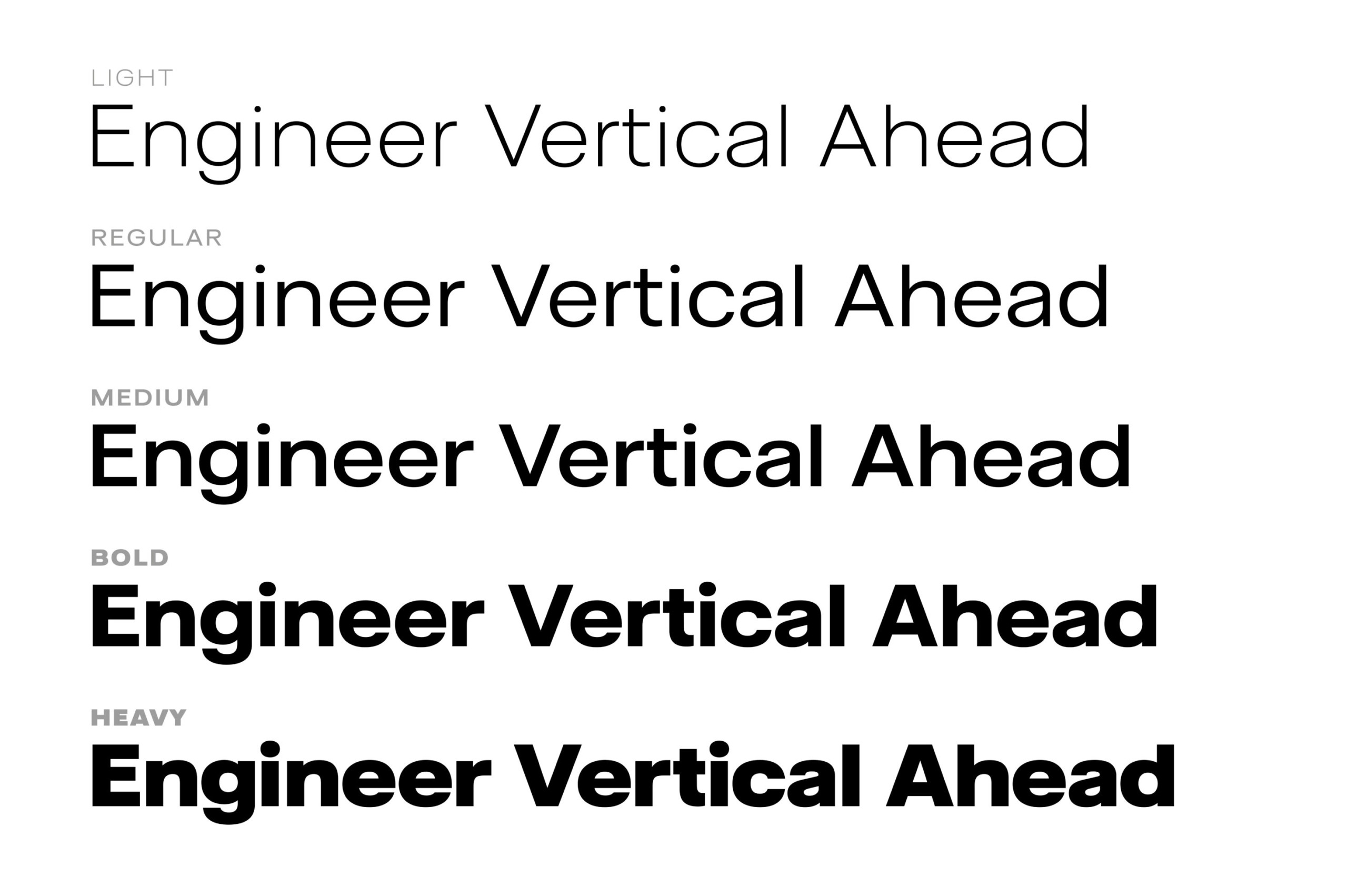
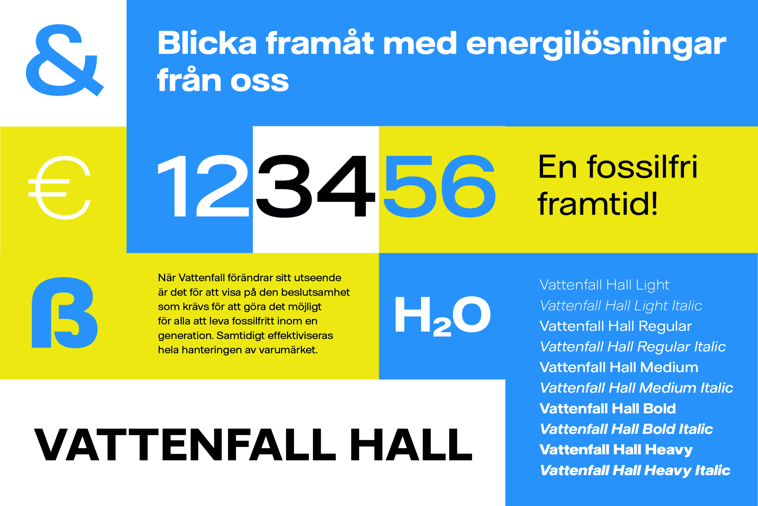
A broad typeface enhances a broad offering. When Vattenfall updated its visual identity, they also wanted the typeface to match, all to emphasize the company’s core values. In collaboration with Nord DDB and their designer Martin Andersson’s initial sketches, we created Vattenfall Hall, a stable and relatively wide sans-serif.
The typeface creates a unique expression and sets the company apart from other energy companies, highlighting the breadth of Vattenfall’s offerings and conveying the feeling of being Europe’s largest and most competent energy company. In conjunction with the new typeface, we also conducted a detailed review of Vattenfall’s new logo.
- Designteam
-
Örjan Nordling
Anders Wikström
Jennie Rudman
- Client
Light

Light Italic

Regular

Regular Italic

Medium

Medium Italic

Bold

Bold Italic

Heavy

Heavy Italic


Light

Light Italic

Regular

Regular Italic

Medium

Medium Italic

Bold

Bold Italic

Heavy

Heavy Italic