Styles


About Polarbröd Boelve
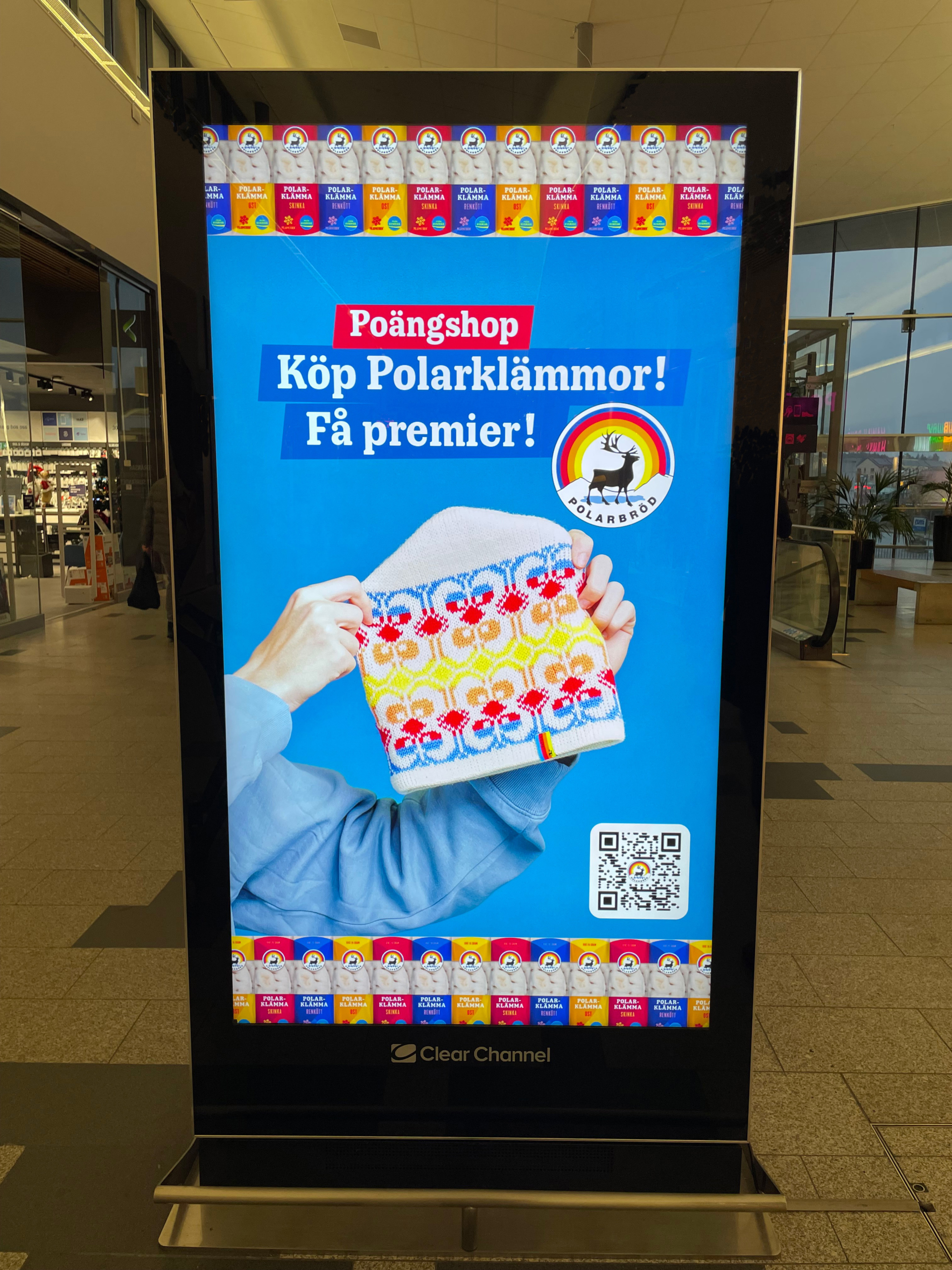
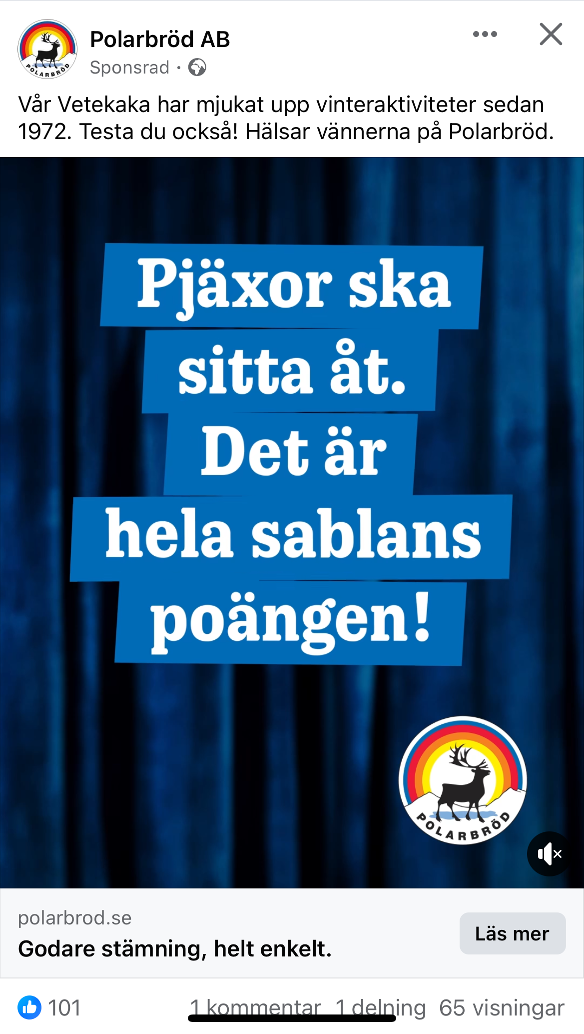
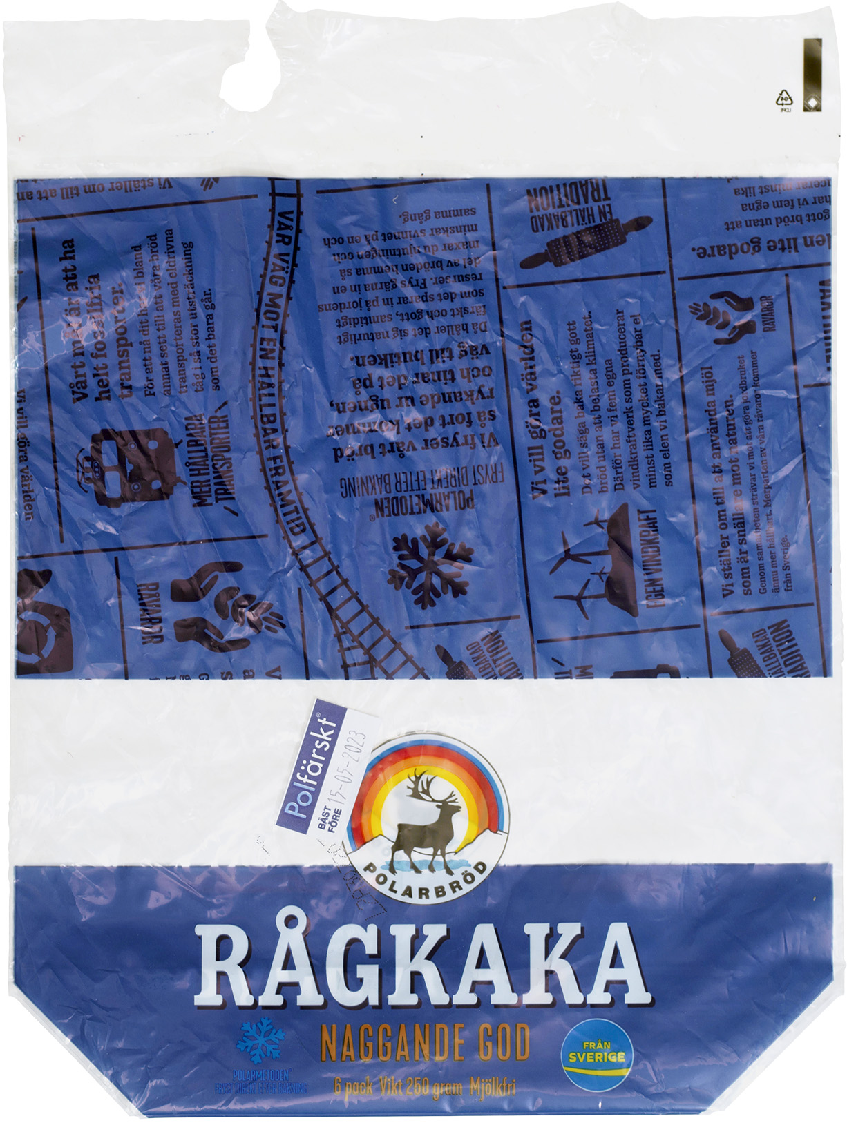
Polarbröd is a family-owned business with roots in Älvsbyn since 1879. The company is owned by the children and grandchildren of the founders of the modern Polarbageriet in Älvsbyn, Greta and Gösta Nilsson. In 2019, before the devastating fire in 2020, we were commissioned to create a unique typeface for Polarbröd, which became Boelve, meaning ”family” or ”tribe” in Sami.
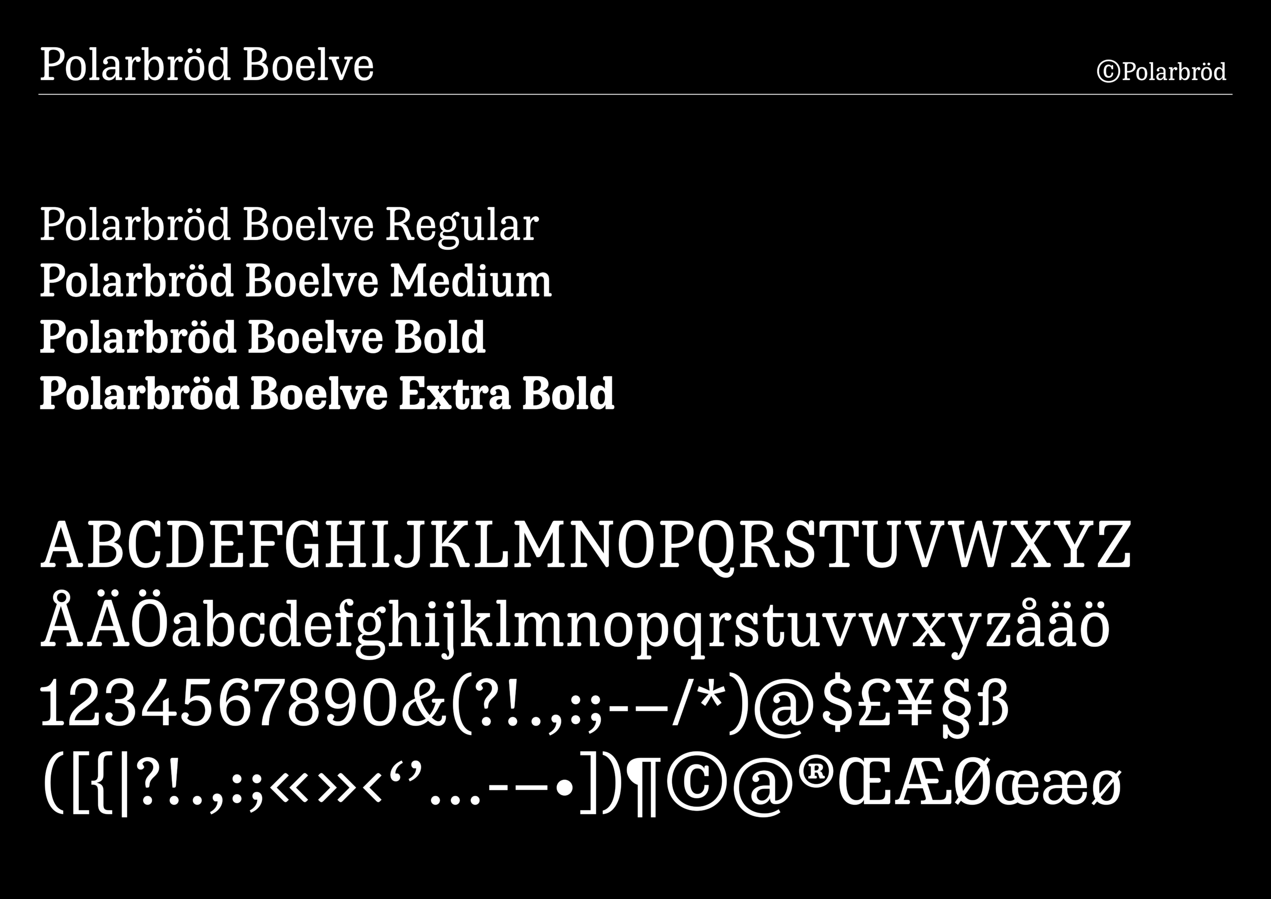
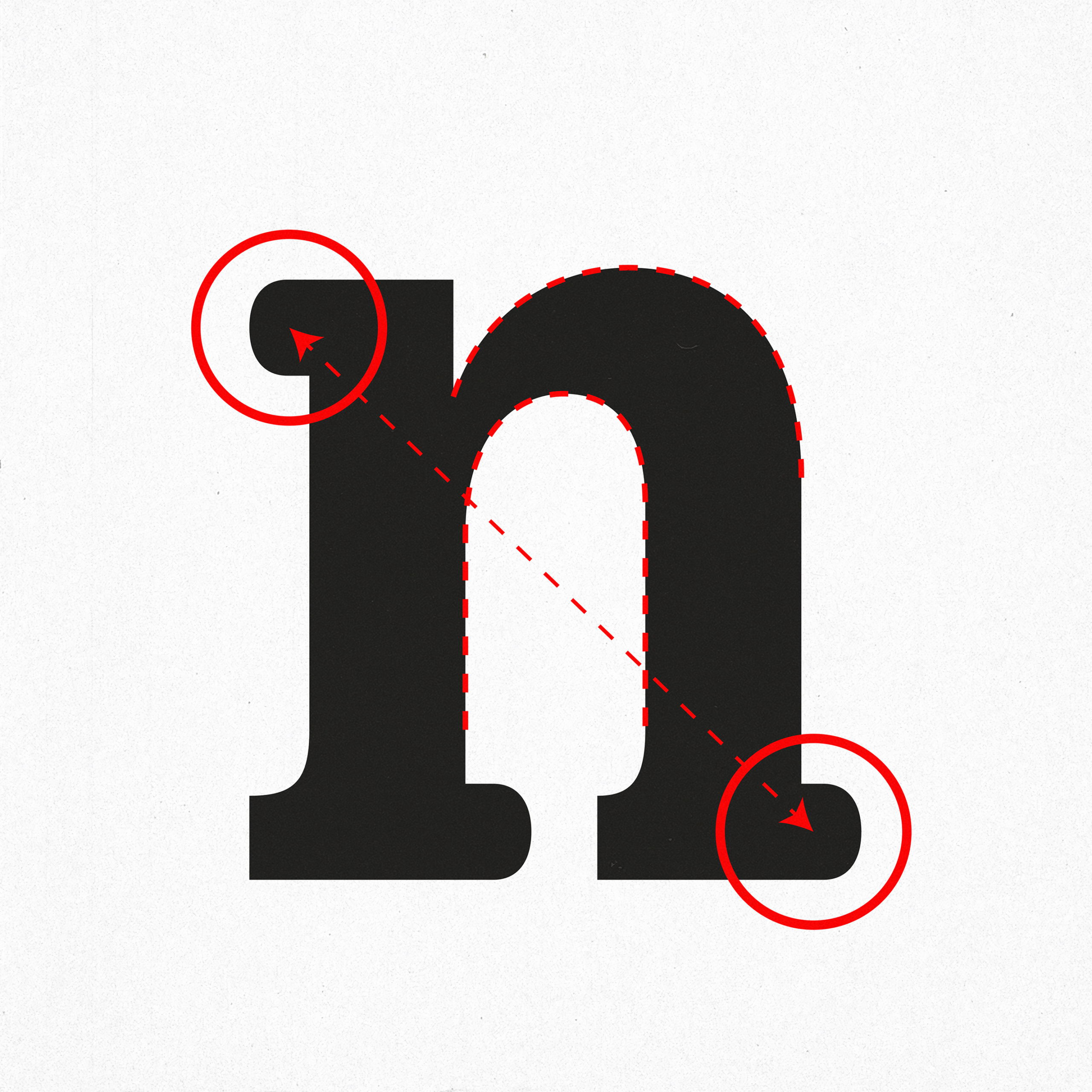
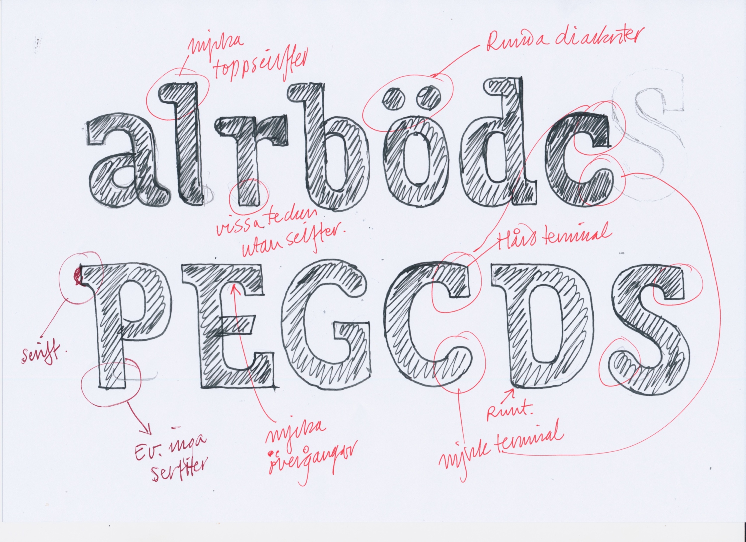
The identity-building typeface is meant to convey Polarbröd’s promise and is a crucial part of the company’s visual identity. Polarbröd’s font is round and soft and has a touch of wood type aesthetics. It is intended to connect to work towards sustainable and long-term food production, as outlined in Polarbröd’s manifesto. The typeface is available in a bold weight used in all identity-building contexts, from packaging to websites. Working with masters (Regular and Bold) allows for the development of new weights. Designed in cooperation with Jonas Ström at This way up.
- Designteam
-
Örjan Nordling, Kristian Möller, Jennie Rudman
- Client
-
Jonas Ström, This way Up
Regular

Medium

Bold

Extra Bold

Regular

Medium

Bold

Extra Bold