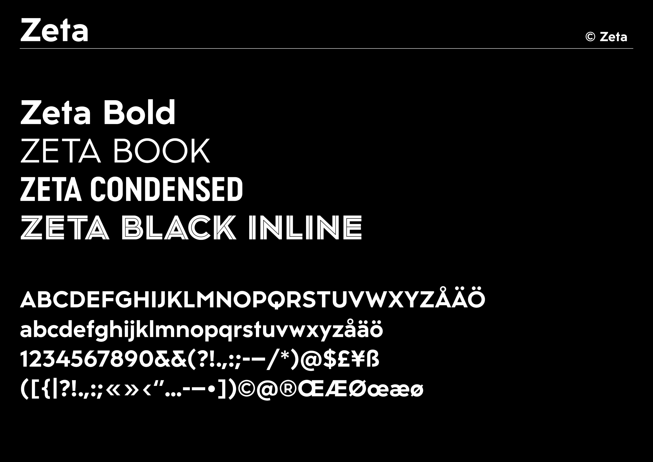
Main styles


Special styles


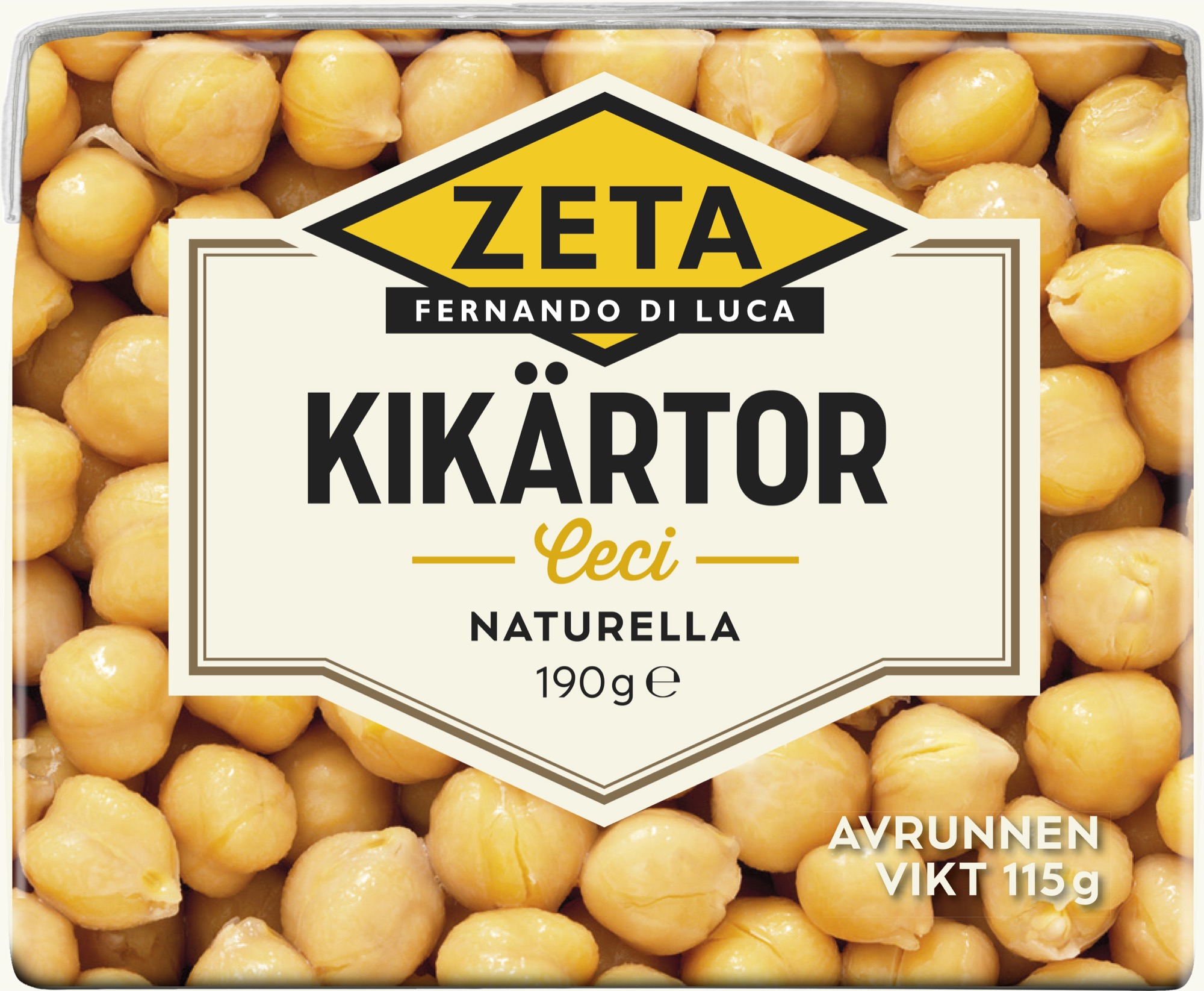
About Zeta
Fernando di Luca, the man behind Zeta, successfully brought Italian food culture to Sweden. To continue his journey, Zeta decided to invest in its own typeface, drawing inspiration from its Italian heritage.
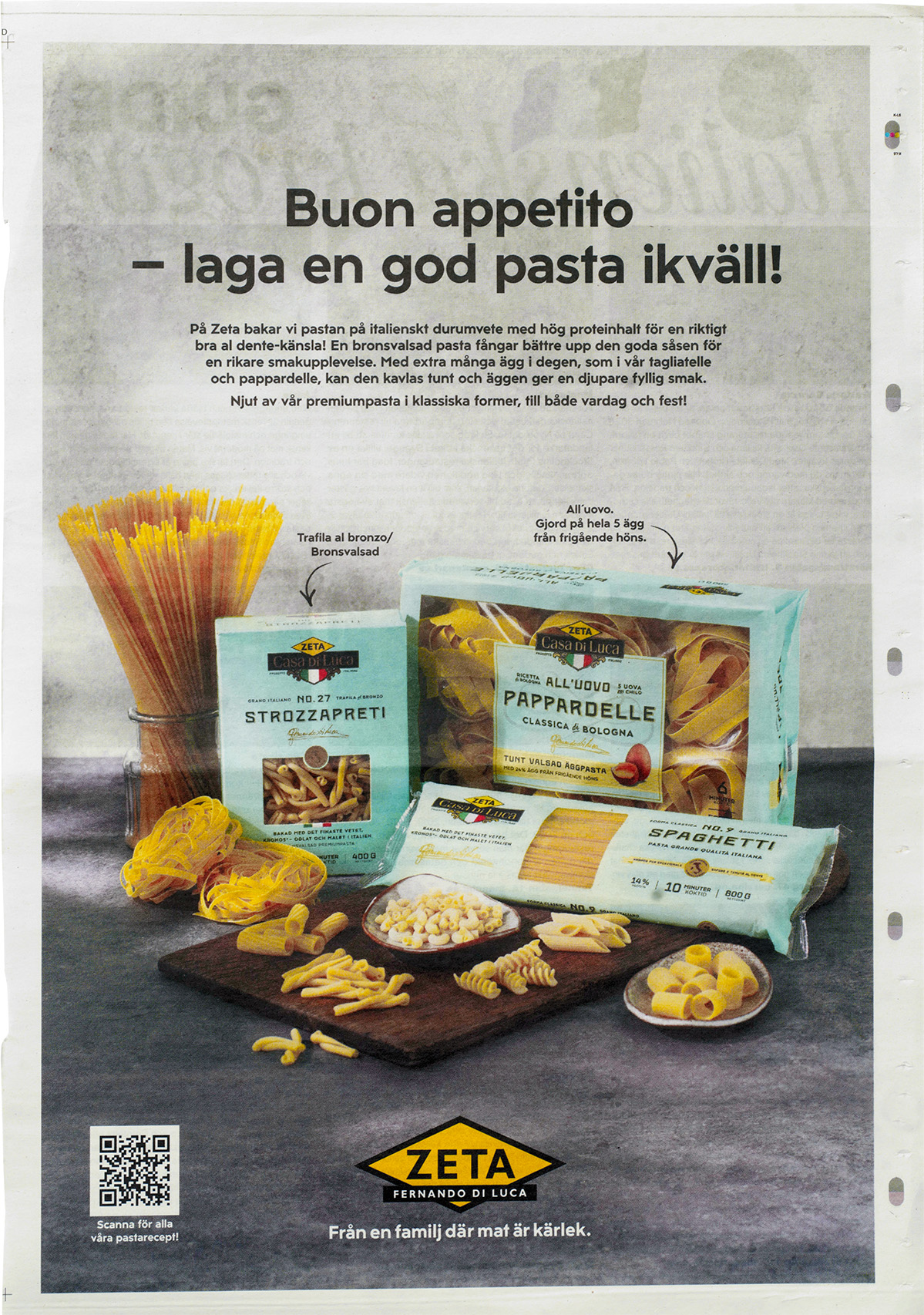
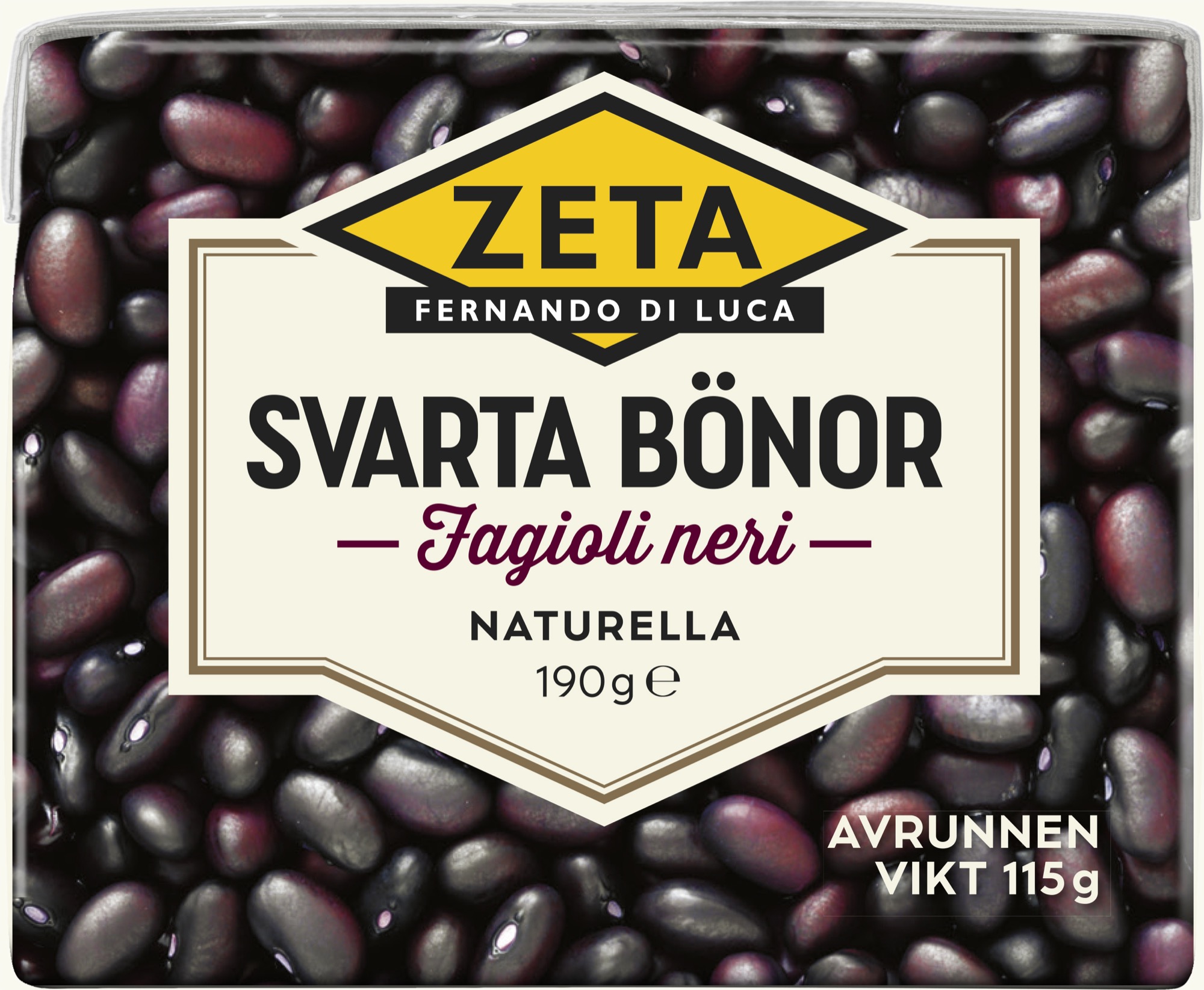
As the food company Zeta expanded with new products and brands, the design firm Hummingbirds was tasked with updating Zeta’s packaging line, which required new typefaces. Our starting point for the typeface’s design was the Art Deco style in the Italian design tradition. It features personalized letterforms characterized by exaggerated variations in letter widths, crossbars at varying heights, and stately uppercase letters. The typeface comes in Book, Bold, Condensed, and an outline variant, now visible on Zeta’s packaging and advertisements.
- Designteam
-
Örjan Nordling, Göran Söderström
- Client
-
Zeta, Hummingbirds
Regular

Bold

Bold condensed

Black inline