Styles


About SEB Sans
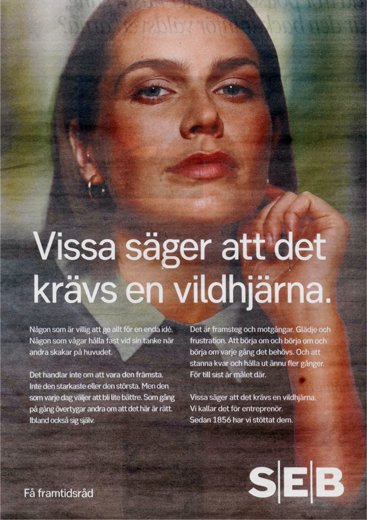
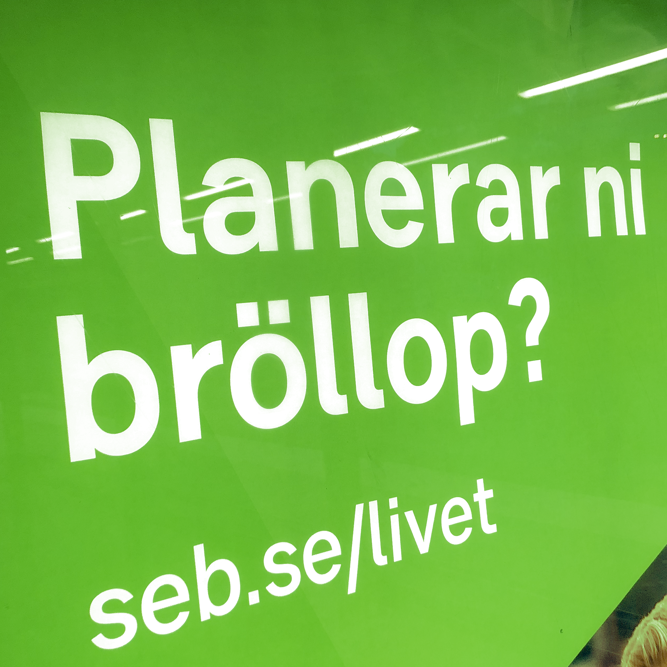
In alignment with its brand promise, ”Care for Ambition”, SEB aimed to enhance communication with its customers and the financial community, leading to the creation of a new typeface.
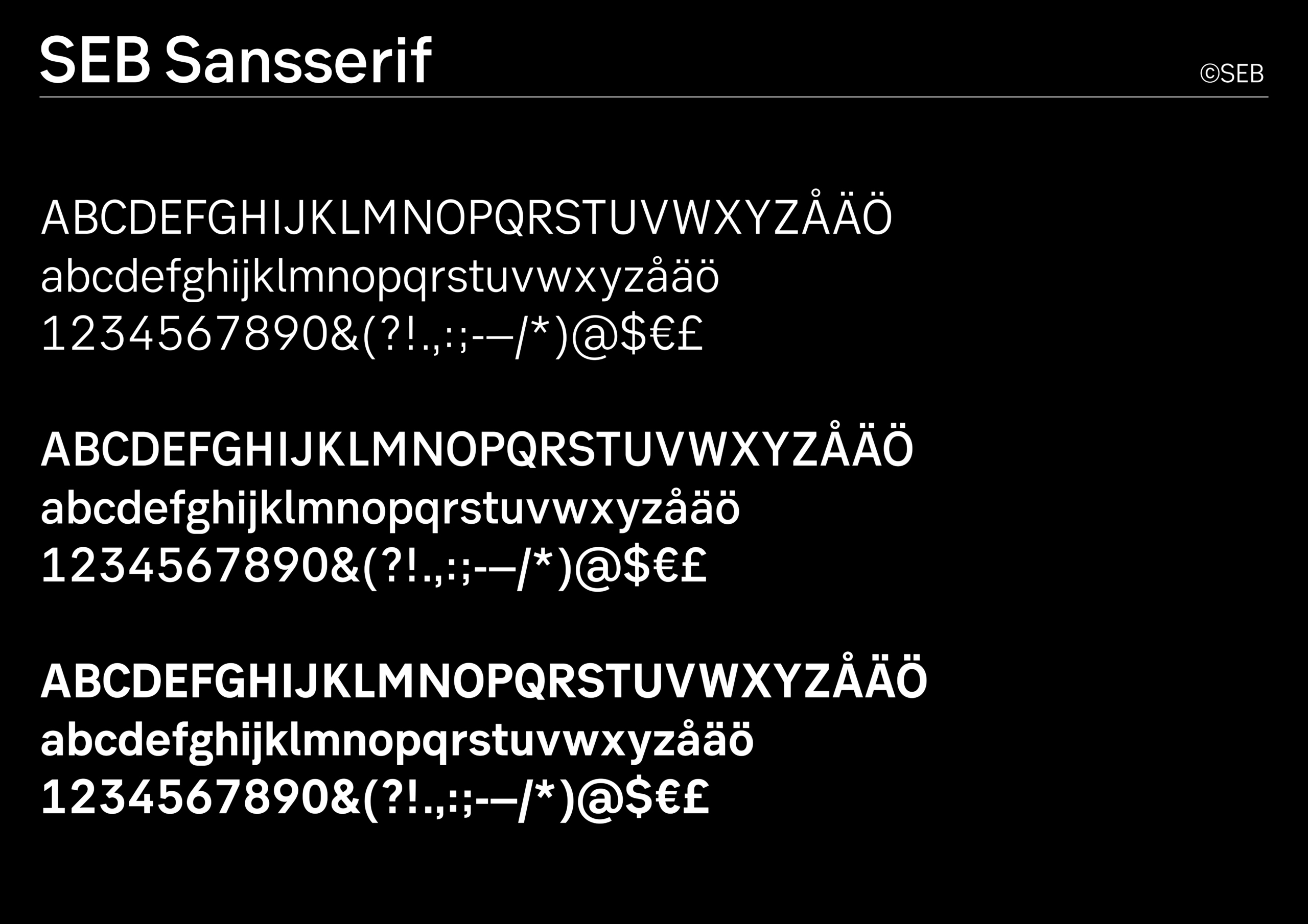
In close collaboration with SEB’s design agency, Kurppa Hosk, the corporate typeface, SEB SansSerif, was developed. The brief emphasized that the typeface should primarily draw inspiration from SEB’s logotype while maintaining a connection to a contemporary, geometric, and low-contrast style of letterform. This font family needed to function effectively in both digital and analog environments to bolster SEB’s brand platform. Within the SEB typeface family, there is also SEB Serif—a variant designed for longer texts.
”SEB is a robust brand in an industry where distinction is predominantly achieved through branding. Consequently, we require a visually strong trademark. Our proprietary corporate typeface, SEB SansSerif, along with our logotype and our distinctive green color, fulfills this need.” Ylva Lipkin, Head of Corporate Identity & Design, SEB
- Client
-
Ylva Lipkin SEB och Kurppa Hosk
- Designers
-
Örjan Nordling/Kristian Möller/Jennie Rudman
- Character set
-
Latin Extended
SEB Sans Serif Light

SEB Sans Serif Light Italic

SEB Sans Serif Regular

SEB Sans Serif Regular Italic

SEB Sans Serif Medium

SEB Sans Serif Medium Italic

SEB Sans Serif Bold

SEB Sans Serif Bold Italic