News
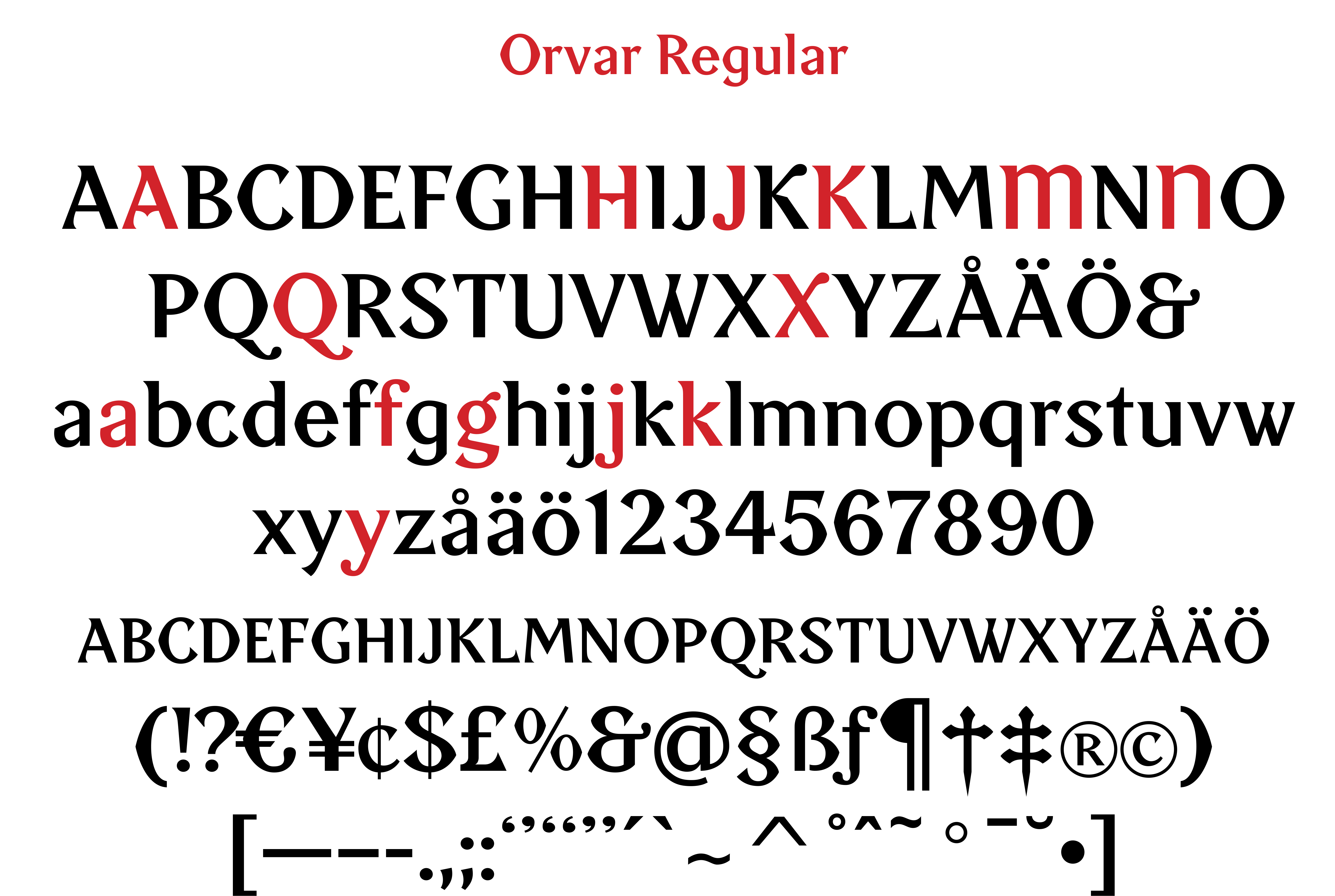
Orvar, a typeface for Örebro SK
Custom font
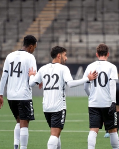
Wow, I’m so happy! My football team, Örebro SK, will play the men’s preseason matches wearing jerseys with my typeface “Orvar” on the back. The typeface is named after Orvar Bergmark [1930–2004], the club’s most famous player of all time.
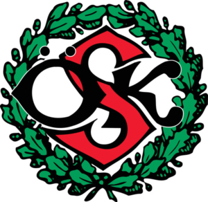
“Orvar” draws its foundation and inspiration from ÖSK’s club emblem from 1908. The capital letters ÖSK in the emblem are designed in a characteristically Art Nouveau-inspired style, featuring “bifurcated” letters – split into two horizontal parts – which give them a unique character.
A good, identity-creating display typeface should not only be easy to read but also carry a sense of emotion and tradition. “Orvar” tells the story of a sports club that has always stood for pride, heart, and passion and has mostly belonged in football’s top tier. And that’s where we want to return!
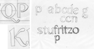
I designed the typeface back during the successful Allsvenskan seasons of 2009–2010, together with designer Göran Söderström. But it is only now that it gets to see the light of day in thrilling match situations!
I truly hope that “Orvar” can contribute to ÖSK’s success in the crucial spring cup matches of 2025!
https://www.facebook.com/share/p/1DpCCnAhxM/
https://www.instagram.com/p/DFNX2zZIVIg/?utm_source=ig_web_copy_link&igsh=MzRlODBiNWFlZA==